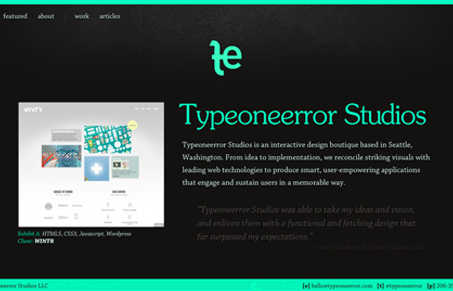
I like the strong green color on top of the black background here. It leaves you feeling like you’ve just seen a unique look. I love how they show wireframe work with their finished work, like this iPhone app example. I also like the copy, it’s not over the top or too silly, it’s professional and clean which is pretty dang hard to do well actually. Good stuff.
Glassmorphism: The Transparent Design Trend That Refuses to Fade
Glassmorphism brings transparency, depth, and light back into modern UI. Learn how this “frosted glass” design trend enhances hierarchy, focus, and atmosphere, plus how to implement it in CSS responsibly.


0 Comments