typeoneerror.com

typeoneerrorcom

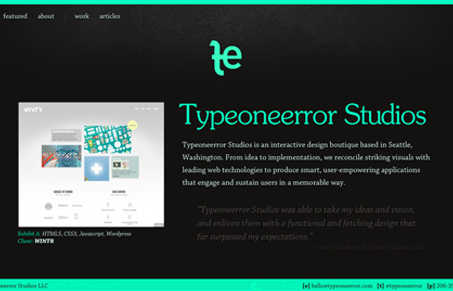
I like the strong green color on top of the black background here. It leaves you feeling like you’ve just seen a unique look. I love how they show wireframe work with their finished work, like this iPhone app example. I also like the copy, it’s not over the top or too silly, it’s professional and clean which is pretty dang hard to do well actually. Good stuff.

0 Comments

Submit a Comment

Your email address will not be published. Required fields are marked *

News & Articles

Looking Fast: The Art of Website Speed Perception

Looking Fast: The Art of Website Speed Perception

In the web world, technical speed and user perception matter. By improving design for a faster appearance, you boost conversions and stand out online. Speed isn’t just loading time; it’s perception.

Designing for Errors: Creating User-Friendly Contingency Plans

Designing for Errors: Creating User-Friendly Contingency Plans

Contingency Design hinges on empathy, understanding user frustration, and transforming errors into positive impressions. By embracing these principles, you enhance user experiences, retain customers, and boost revenue in the competitive digital landscap