
by Gene Crawford | Oct 29, 2014 | Gallery, Marketing Company
Pretty standard feeling layout but they’ve used some smooth scrolling motion in the main nav bar and other elements to make the site have a nice memorable component. I like it.

by Gene Crawford | Oct 29, 2014 | Gallery
Wonderfully simple but elegant layout. Tight spacing between elements and good vertical rhythm really makes this site feel like it was crafted with love. Also – check out the map on the contact page – same Google map – different look though.

by Gene Crawford | Oct 28, 2014 | Gallery
Very intriguing layout. I like the main hero image area and the way pieces scroll into view. The map and contact form have a nice designery touch too.

by Gene Crawford | Oct 28, 2014 | Gallery
Pretty crazy navigation interactions on the Komunigrafik site. I’m not sure how I feel about it, what about you guys?
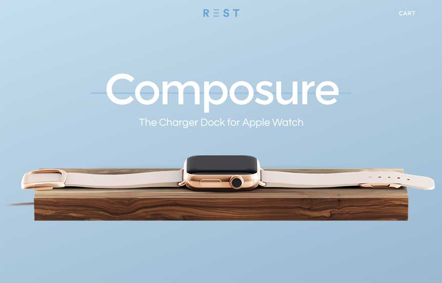
by Gene Crawford | Oct 28, 2014 | Gallery
Very cool site design. looks like a cool product too – we won’t know until the Apple Watch comes out 🙂