by Gene Crawford | Feb 25, 2026 | News
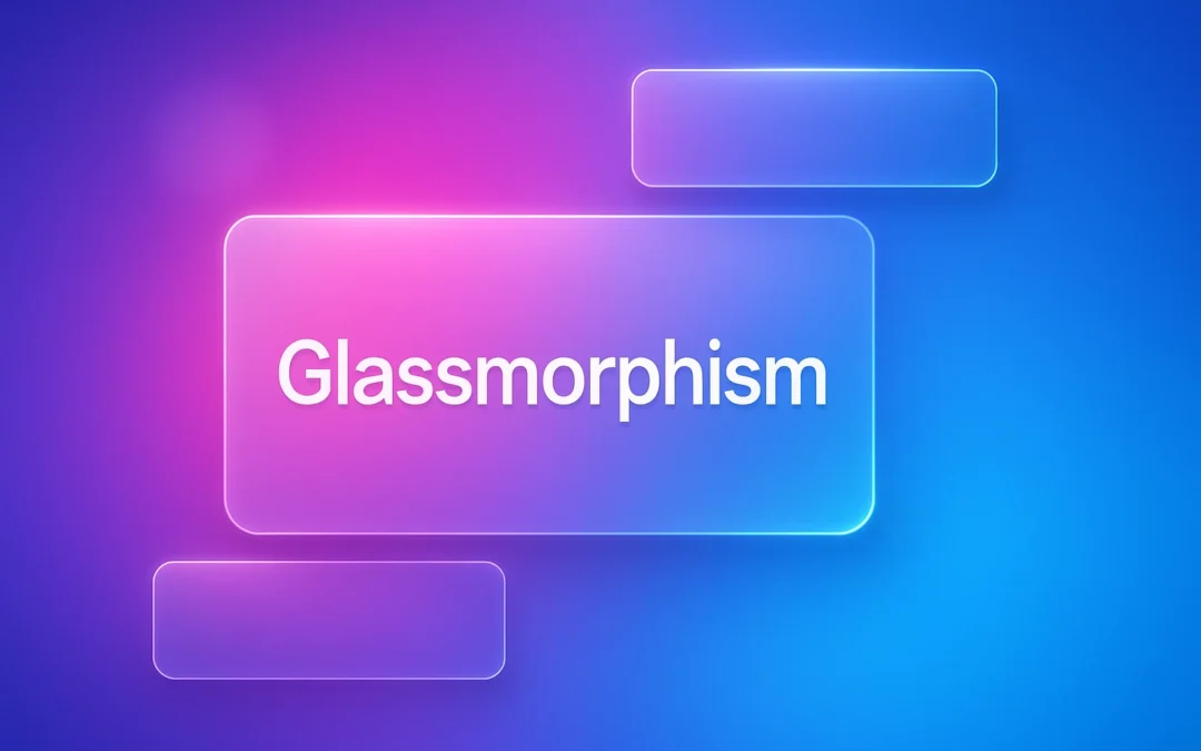
Once a relic of early iOS interfaces, the “frosted glass” look is back, and sharper than ever. Glassmorphism isn’t just a visual gimmick; it’s a design language rooted in transparency, depth, and light. From macOS Big Sur to Windows 11, and even modern web apps,...

by Gene Crawford | Feb 3, 2026 | News
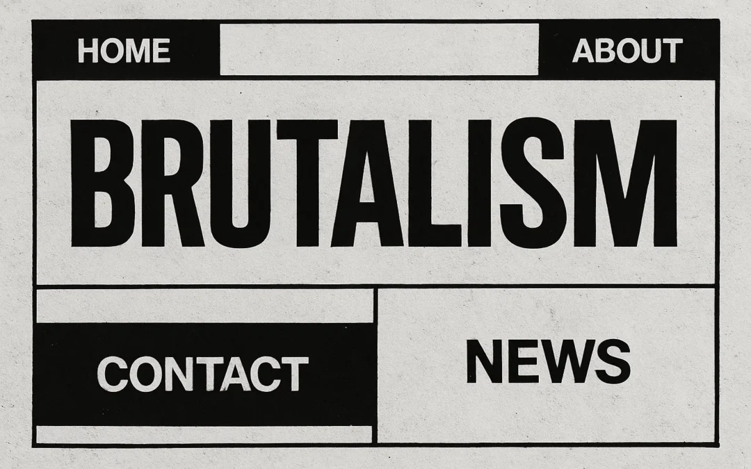
Brutalism doesn’t care about being pretty, it cares about being real. In an era of safe, polished, and algorithm-friendly layouts, Brutalist web design stands apart as a visual rebellion. It’s the anti-aesthetic: raw, unapologetic, and refreshingly human. What Is...

by Gene Crawford | Jan 7, 2026 | News
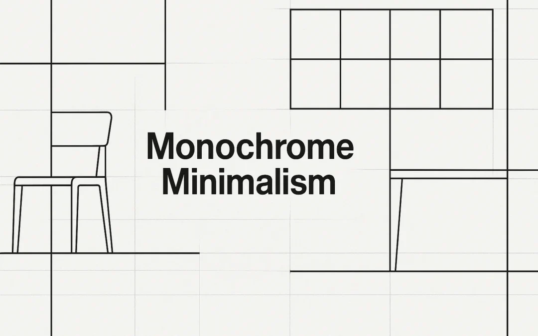
What happens when Bauhaus rationalism meets IKEA’s flat-pack pragmatism? You get Monochrome Minimalism, a design movement where functional modernism meets mass accessibility, wrapped in calm whites, grays, and geometry. Today’s web and product designs owe more to this...

by Gene Crawford | Oct 13, 2025 | News
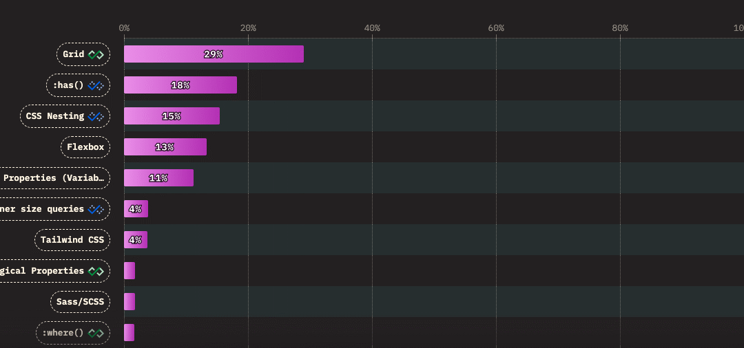
Over the past five years, a handful of new CSS features have completely reshaped how we build for the web. According to the 2025 State of CSS Survey, these are the true game-changers: 1. CSS Grid (29%) Grid made full-page layout a native capability of CSS. No more...

by Gene Crawford | Aug 12, 2025 | News
Grids are the silent force behind every clean, intuitive user interface. They bring structure to creativity—guiding the eye, organizing content, and helping your design scale gracefully across every screen size. Whether you’re mocking up in Figma or coding live...

by Gene Crawford | Jul 22, 2025 | News
How can understanding mental models transform your web design process? These cognitive blueprints shape perceptions and decisions, leading to intuitive, user-centered designs. Unlock the power of mental models to enhance decision-making and user experience in web...
