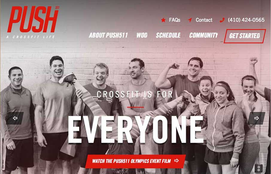
by Gene Crawford | Oct 30, 2014 | Gallery, Sports/Recreation
Nicely designed gym website for Push511 – most of the time websites in this category are just awful. This one however is one of nicest i’ve seen across many categories. Great work on almost all of the elements that make up a top-notch site here.
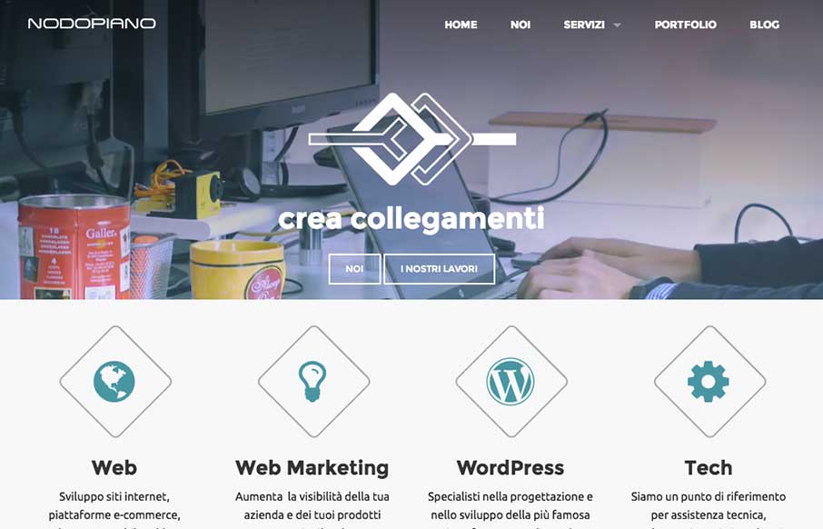
by Gene Crawford | Oct 27, 2014 | Gallery
It’s always nice when there’s a strong base to a design and always awesome when you layer good detail work on top of that strong base. That’s what the Nodopiano site design does so well. This is my last work,the website for an italian web agency....

by Gene Crawford | Oct 20, 2014 | Gallery
You don’t see many site designs that have that fixed nav bar layout anymore, it’s not part of what’s trending. But when you find a site with it done and done well, it’s good stuff indeed. I really dig this layout, it’s very intuitive and...

by Gene Crawford | Oct 15, 2014 | Gallery
The page just keeps going and going, but it’s all good stuff. That’s rare for website’s I come across.
by Gene Crawford | Oct 14, 2014 | Gallery
You just have to love a website design that get’s spacing. That’s the thing that hits me the most on this site, the spacing and timing of all the elements and sections as you scroll down. Put that together with the soft feel they’ve used for all the...