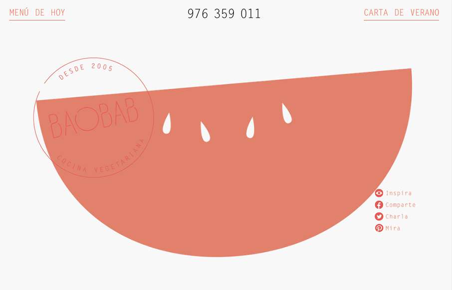
by Gene Crawford | Aug 31, 2015 | Food and Beverage, Gallery
I really like the open feel to this design. The typography and the way it interacts with the white space is also pretty nice in that it feels vibrant and not just minimal. Love the colors and implied simplicity behind the visual layout too.
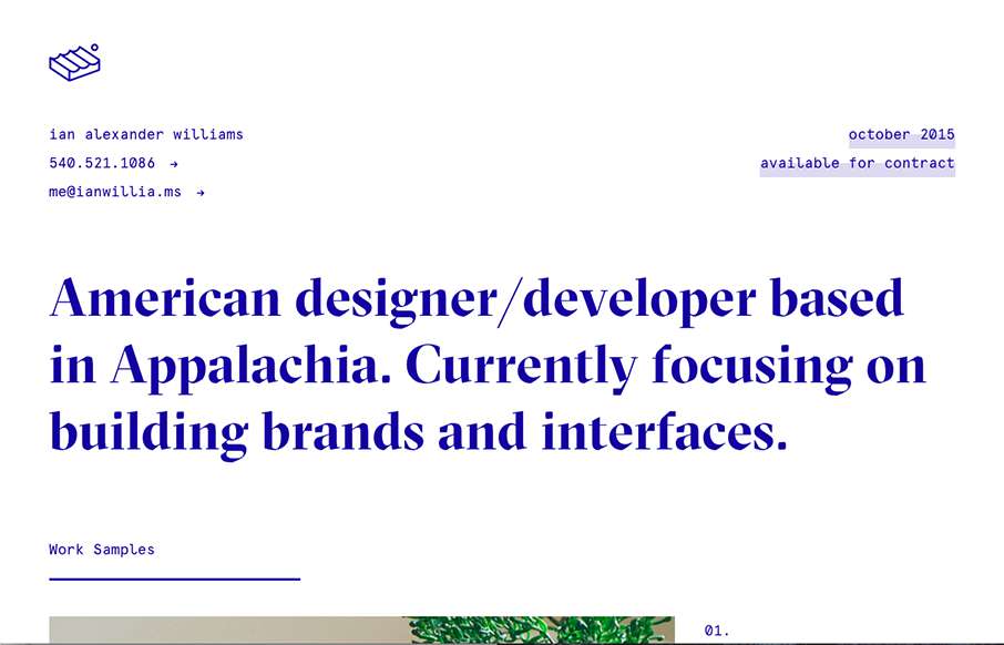
by Aaron Griswold | Aug 27, 2015 | Gallery, Portfolio
Ian Williams out of Virginia – love it. I’ve seen other sites like this- “looks” liked stripped out design – but they’ve been pretty, well not good. Ian’s is an excellent example of how to. It’s different without being...
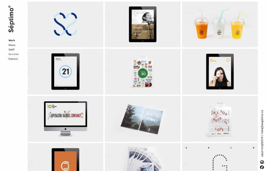
by Gene Crawford | Aug 18, 2015 | Gallery
The strict “blocky” grid in this design is pretty cool. It’s been done before and fairly straightforward but when used in this context it feels fresh and unique almost. I dig the fixed left nav too. Check the different screen width design changes out...
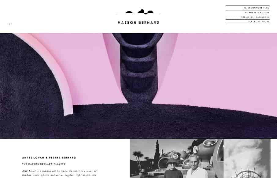
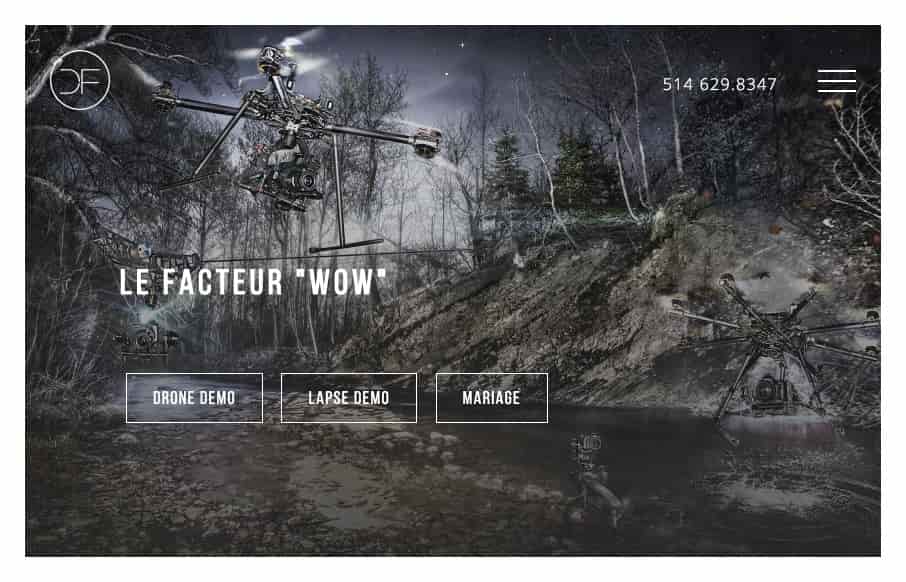
by Gene Crawford | Aug 12, 2015 | Gallery
Very unique looking website here. I really dig the asymmetry to the layout and the overall vibe. The slight parallax image treatment on the header area as you scroll for the first bit is superb. From the Designer: The Maison Bernard is one of the most beautiful...
by Gene Crawford | Aug 3, 2015 | Gallery, Product
My first thought when I went to this site was “wow, damn nice photography” then I was like, “what’s up with that hamburger menu design…” As I considered the design though, I realized that those main 3 links/buttons are really all...