by Gene Crawford | Jul 22, 2016 | Fashion, Gallery
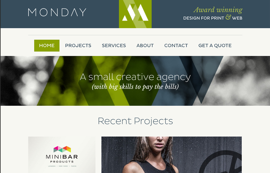
Just a solid straight forward website design. Everything is placed just right and works like it should. It’s beautiful visually and has strong color usage and branding. Just good work that deserves a second look.
by Gene Crawford | Jul 21, 2016 | Gallery
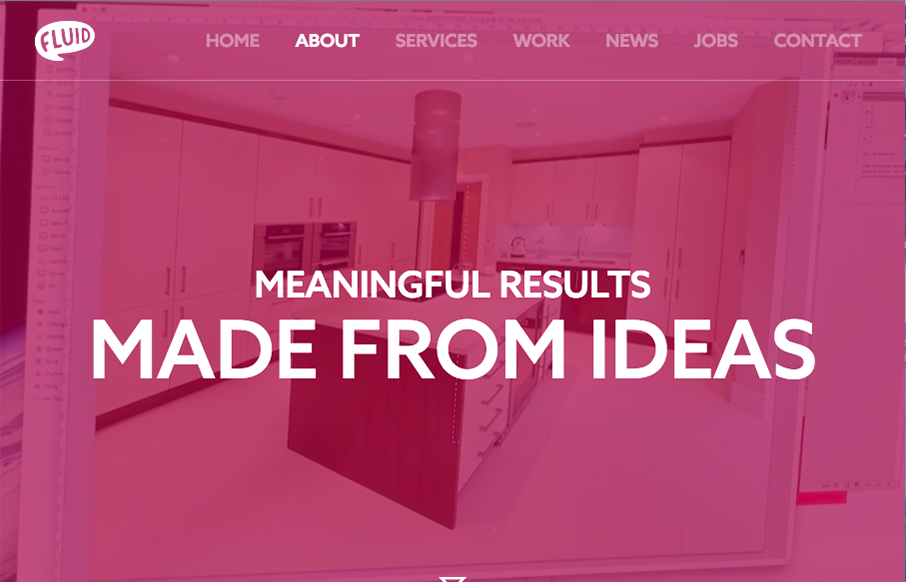
I can really appreciate the simple approach to this site design. Just big bold areas of content and imagery. I love the way the interaction on the main nav works. Graying out the nav items that you’re not mousing on. Good thinking there on the UI.
by Gene Crawford | Jul 11, 2016 | Gallery
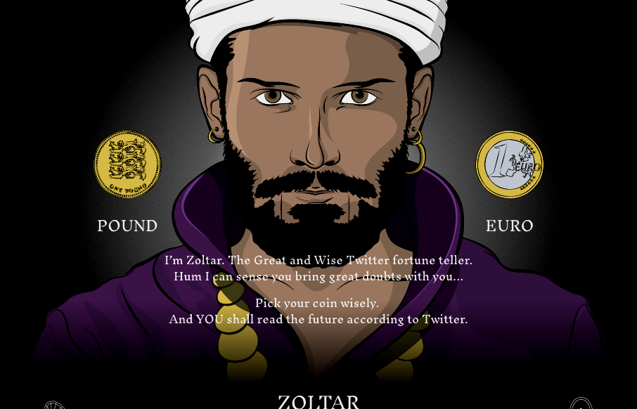
Cool site from @weareimpero. I’m a little late posting it, they technically submitted it before the Brexit. Still pretty neat though. From the Designer: Zoltar and the entire site is hand illustrated. The site is heavily based on SVG, both Zoltar and UI elements...
by Gene Crawford | Jun 6, 2016 | Gallery
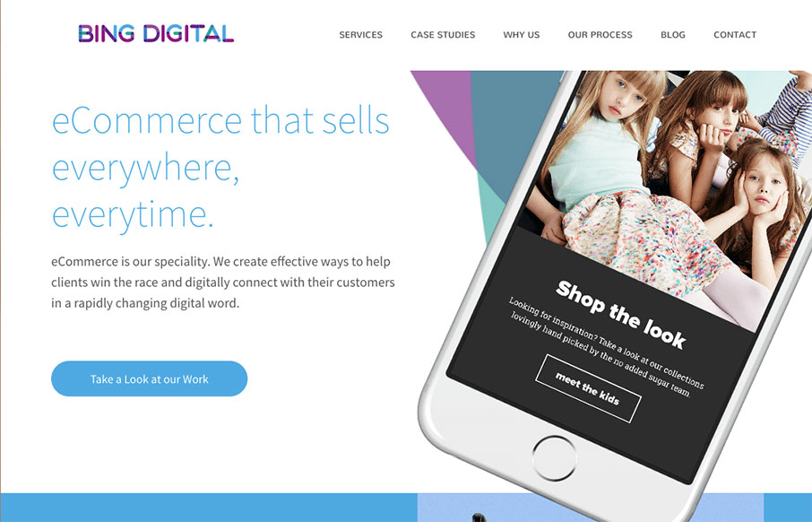
Nice dynamic looking layout for Bing Digital. I love the soft colors and the imagery that helps sell the idea that they know what’s up. The thing I like most is how they list out all the stuff they do in the footer area. So clever and simple, yet most never do...

by Gene Crawford | May 17, 2016 | Gallery, Travel
I like how this design feels very open. The interactive parts are sort of placed on top of the imagery to make it feel like it’s floating there. There is also a play between the back and forward arrows and the entire, oversized, image changing out too. Cool...