by Gene Crawford | Sep 29, 2015 | Gallery
I love minimal and clean design. This site pushes it to the limit. It’s doing everything right on that side of the house. I do think it falls short a little with the nav items being set in white text, they can get lost based on the background images. However...
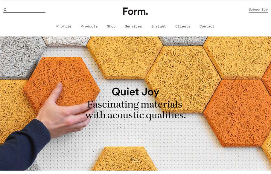
by Gene Crawford | Sep 29, 2015 | Gallery
Beautiful minimal products deserve a website that matches. The Form website doesn’t fall short. A simple and elegant grid layout mixed with some simple type and photo direction make for a really great product website.
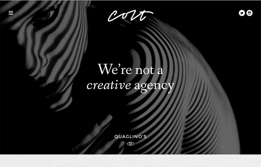
by Gene Crawford | Sep 28, 2015 | Design Firm, Gallery
This site design hits all the “now” standard things design and interaction wise. But sometimes you get it just right, I love the smooth feeling vibe to this site and the imagery is quite nice. The way the case study images load as you scroll for the first...
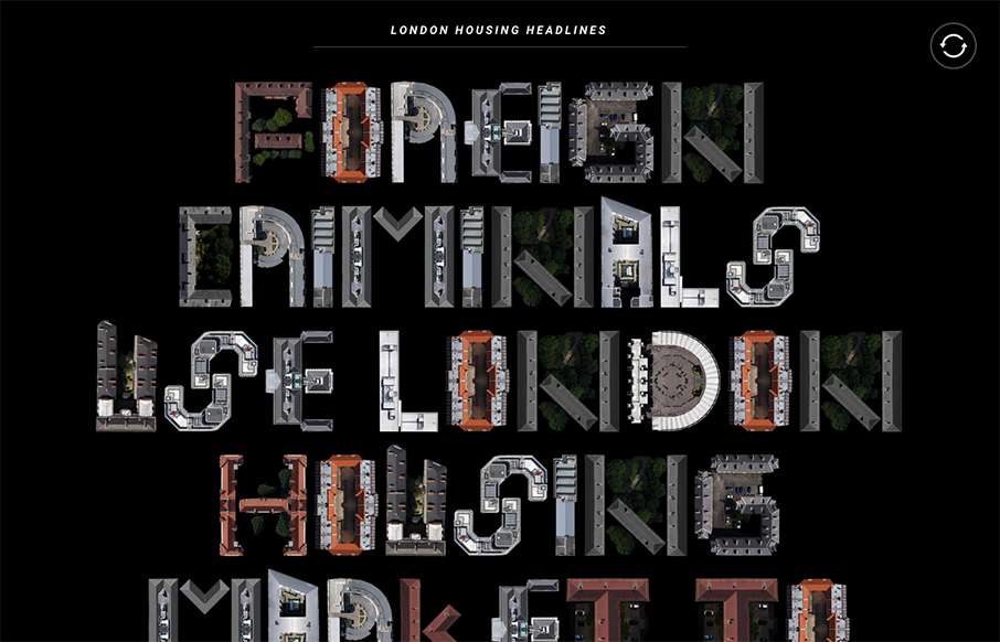
by Aaron Griswold | Sep 15, 2015 | Gallery
The London Housing site is very simple in concept – I just like the typewriter movement of it, along with using real shapes to make the font / lettering. Here’s a little more about the site: “This project is a compilation of recent media articles...
by Aaron Griswold | Sep 11, 2015 | Gallery
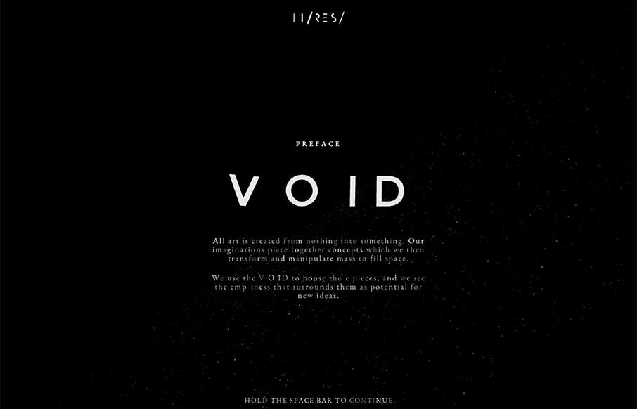
I didn’t even attempt to see what was under the hood on this site – didn’t care – was having too much fun with it. Void was done by Hi-Res out of London. Not sure why they did it – but who cares – pretty darn awesome – happy...