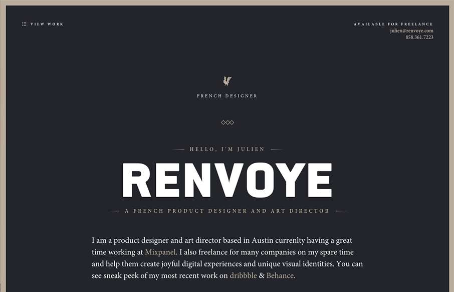
by Gene Crawford | Nov 17, 2015 | Gallery
What a beautiful yet simple website to show off your work. Julien Renvoy’s portfolio site hits on all the right notes to make me swoon a little bit. I love the dark colors and little animated interaction details. This is what it’s supposed to be! 🙂
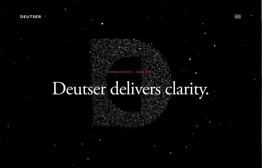
by Gene Crawford | Nov 10, 2015 | Gallery
Some real neat visual/interaction stuff going on here. It’s cool and works well and I think users who are not web designers will kind of dig it. The rest of the website from content to execution is top-notch as well. Good stuff and worthy of checking out. From...
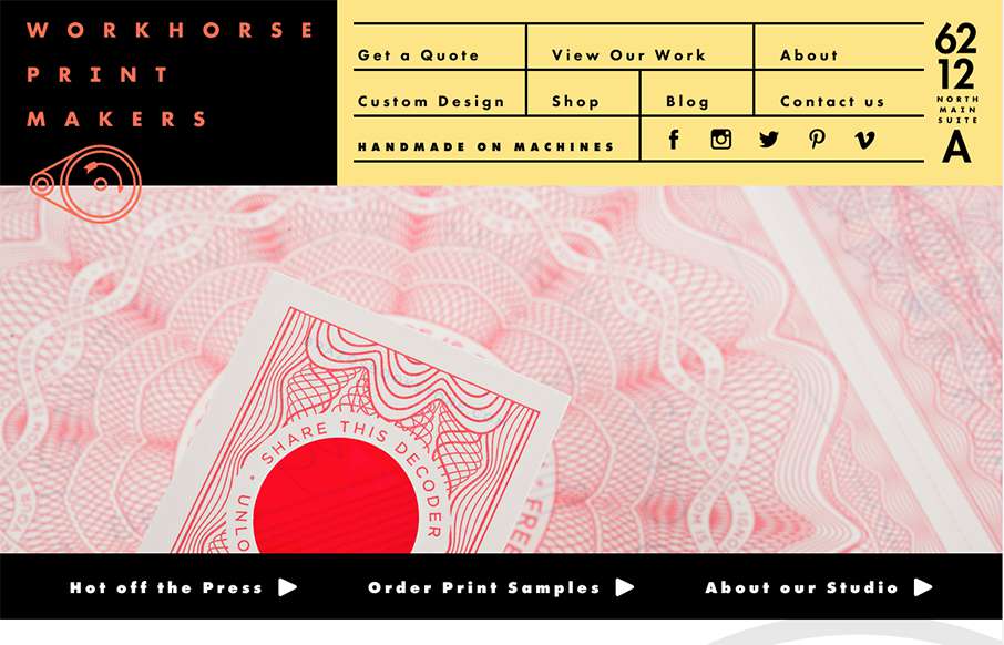
by Aaron Griswold | Oct 14, 2015 | Gallery
Hands down, the best navigation we’ve seen in a while in this site for Workhorse Printmakers, made by Spindletop out of Houston (think we’ve reviewed their site earlier this year too). Love this header nav block – definitely makes you think of a...
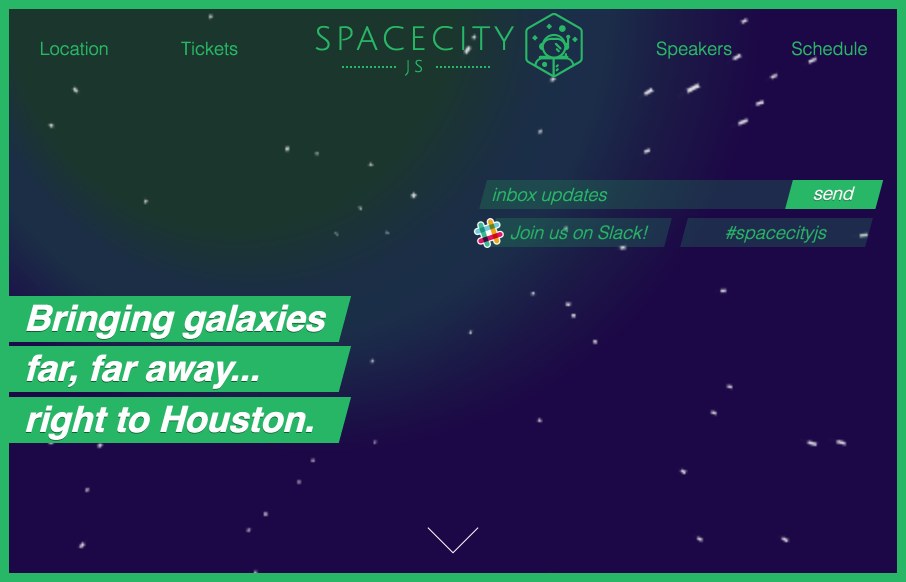
by Gene Crawford | Jul 6, 2015 | Gallery
Website for the Space City JS conference in Houston. I like the play between the name and Houston! This site isn’t like a traditional web conference site, it doesn’t do what you’d expect and put the images of the speakers front and center. I like...

by Gene Crawford | Jun 30, 2015 | Gallery, Travel
We don’t normally do a lot of iPhone app page’s here in the Gallery but when Paravel does an app like this you gotta take notice. This one pager is stunning, from the logo/branding to the layout itself. Gushing here a bit but damn guys. Nice.