
by Gene Crawford | Sep 30, 2015 | Gallery
The Loppist is a great example of a website with a “mega” drop-down navigation design. I really like this and how it shows more info before you drill down into the site. It’ll help that pogo-sticking thing that people get into on a product site.

by Gene Crawford | Sep 23, 2015 | Gallery
What a beautiful yet simple layout for Think with Google. I love this, material design in play as well here. Well balanced sections and plenty of space between elements make this easy to scan, read and remember.

by Gene Crawford | Sep 22, 2015 | Gallery
Clear layout and hip colors and type make the Skeleton website stand out. I like the focus on the case studies first – after all it’s what you want people to check out. I dig that you get a bevy of info after you make your way past those 3 project...
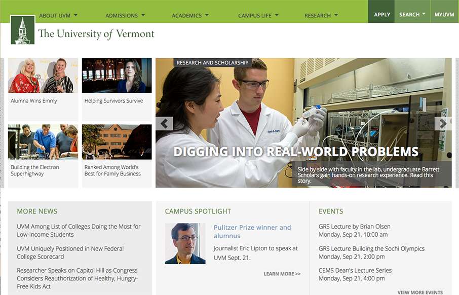
by Gene Crawford | Sep 21, 2015 | Education, Gallery
Great example of a responsive site for a university. Aside from the great responsive work here, I also love the main nav and search area. It’s a mega-dropdown style but the entire page sort of slides down. The search box works the same way but it has everything...
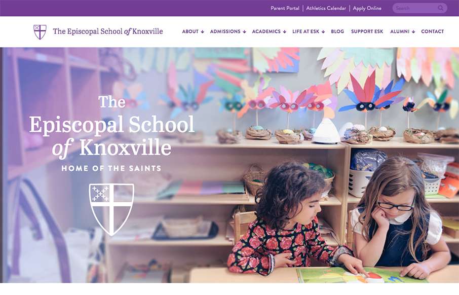
by Gene Crawford | Sep 17, 2015 | Education, Gallery
What a beautiful website. I love just about everything about this site design. The nav is pretty standard and easy to get into. I LOVE the illustration work at the center of the page then the footer area is quite nicely setup and laid out it’s great.