
by Aaron Griswold | Nov 18, 2015 | Gallery
Slider / carousels are dead right? Not if they are done well, with a dash of novelty – like in this agency site by Digiti out of Belgium and New York. (as an aside, I’ve noticed a lot of good development work on websites out of Belgium this year) I admit,...

by Aaron Griswold | Oct 26, 2015 | Fashion, Gallery, Shopping
We’ve started to see a couple of good sites coming out of Lithuania lately – and I like this one from OVO. I really like the transparent logo, and how it plays on different pages – also like the fact that they are willing to partially cover up the...
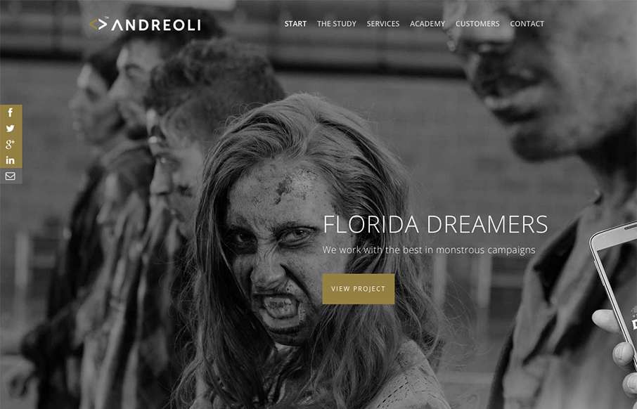
by Aaron Griswold | Oct 20, 2015 | Gallery, Marketing Company
I like the color scheme of the Andreoli agency site out of Spain. Yes, I know it’s gold with a bunch of white/grey/blacks – but I still like sites with one highlight color to emphasize what they think is important. And love the zombie lady – we...
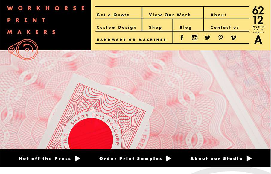
by Aaron Griswold | Oct 14, 2015 | Gallery
Hands down, the best navigation we’ve seen in a while in this site for Workhorse Printmakers, made by Spindletop out of Houston (think we’ve reviewed their site earlier this year too). Love this header nav block – definitely makes you think of a...

by Aaron Griswold | Oct 13, 2015 | Gallery
Sharp new site from Sequoia Capital out of Menlo Park. Like the intro image that leads down to the cool vertical slideshow, with great suped-up images, and a cool overlay on the left.