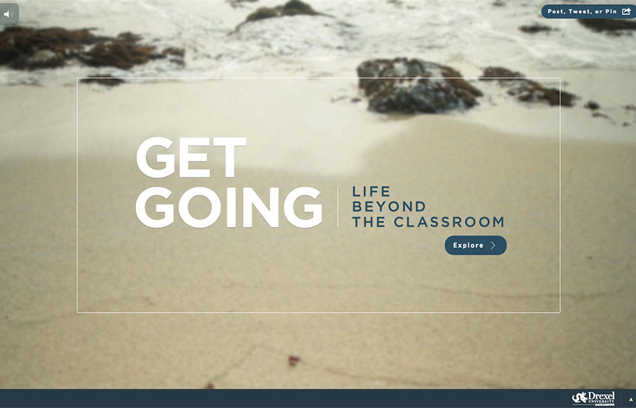
by Aaron Griswold | Mar 14, 2016 | Education, Gallery
Great use of multiple video backgrounds (and a slider) to tell stories for Drexel University’s Sacramento campus through the site “Get Going Today”. It’s a cool way to navigate through a site, and just explore.
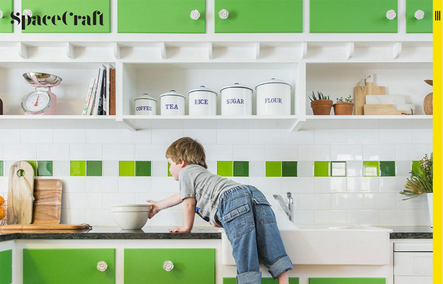
by Aaron Griswold | Mar 2, 2016 | Gallery
Two things about the Spacecraft site out of Australia I like are the vertical hamburger (because it is technically different than all the others) – and I like the simplicity of the mouse-over / overlays on the block design – it’s just a label and...

by Gene Crawford | Feb 29, 2016 | Gallery, Nonprofit
Very simple color palette, and good typography from the TSE Foundation out of Hong Kong. I first saw it in a smaller screen – but it really opens up on a desktop and looks great, because it’s simple.

by Aaron Griswold | Feb 23, 2016 | Gallery
Out of Berlin – Nut & Woods’ site is pretty tight. The best thing about the site has to be the navigation – hover over the “Tables” nav item – see the “dropdown” – but then (since they are selling stuff) the...

by Aaron Griswold | Feb 1, 2016 | Gallery, Portfolio
Portfolio of Isaias Mulatinho out of Brazil – I like the red and white on the black – and the cool logo. From the Designer: This is a release of my works during the last years, branding, designing and marketing. Thank you for appreciating. Submitted by:...