
by Gene Crawford | Apr 8, 2013 | Gallery, Portfolio
This site feels pretty smooth/slick to use. I like the slider on the home page and the way the nav slides up to be fixed in position. Then all the sub pages are well designed and cleanly executed. I like this less is more approach to the layout with the nice...
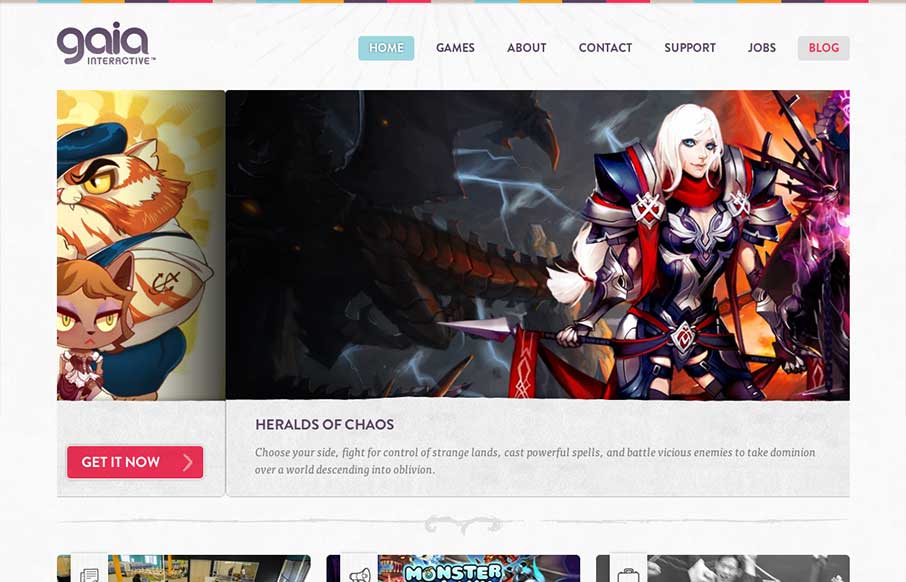
by Gene Crawford | Apr 3, 2013 | Gallery, Gaming
A very colorful and clean design for gia interactive. It’s a perfect fit and seems to provide perfect function for the gaming company. It’s the right amount of stuff and balanced design elements across the breadth of this site. Lovely work. Case study on...
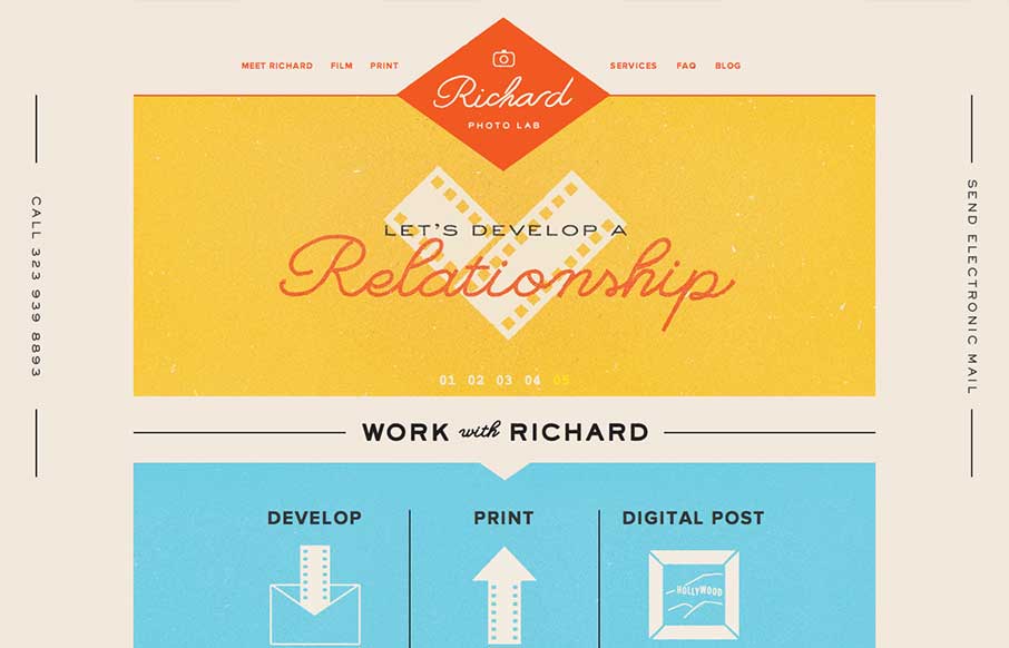
by Gene Crawford | Apr 2, 2013 | Gallery
Lovely website design. I particularly love the way the logo changes to a smaller mark as you scroll down the page. Overall the feeling of the design is very comforting and fresh. It’s a responsive solution as well which is a nice finishing touch.

by Gene Crawford | Mar 11, 2013 | Education, Gallery
This is a well structured website. The grid is clear and easy to visually track the different sections of links. College websites are traditionally over-packed with links, this one is no exception but it’s designed in visual chunks so you can take it all in. I...

by Maria | Feb 25, 2013 | Education, Gallery
Sensory parfait. The layers of sounds, texture, and motion are only the beginning. I love the parallel, whether intended or not, of the site having a Choose Your Own Adventure feel. Metaphorically, it works so well on a site for getting a higher education degree. I...