by Aaron Griswold | May 7, 2014 | Gallery, Portfolio
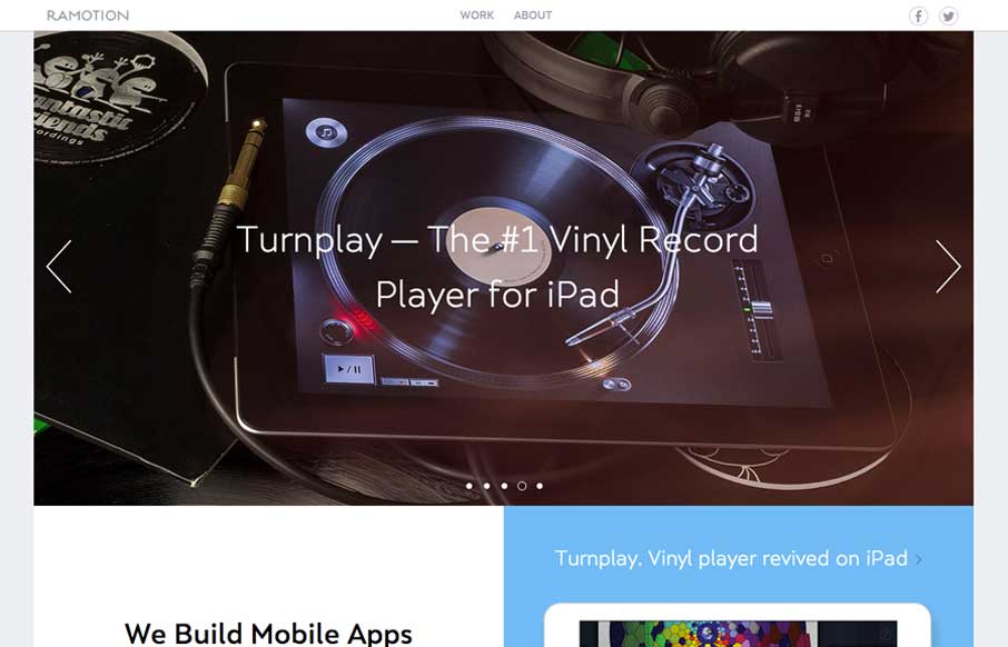
Really, really great design for a portfolio site. I love the different pieces worked up for the slider/hero area. Brilliantly visualized and communicated stories. The rest of the site is simply wonderful and simple as well.

by Gene Crawford | May 1, 2014 | Gallery
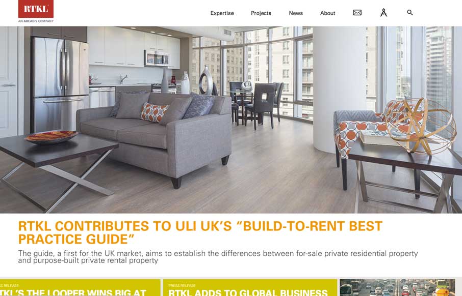
Beautiful and simple approach to this site’s layout. Cool use of the Masonry like layout below the hero image area too – actually putting it to work via the content too.

by Gene Crawford | Apr 24, 2014 | Gallery
What a nice minimal(ish) design approach. If I were to think about what a site for a company that designs apps/icons this is what i’d hope I’d come up with. Beautiful sections and simplified nav choices make this site super easy and laid back feeling while...

by Gene Crawford | Apr 16, 2014 | Gallery
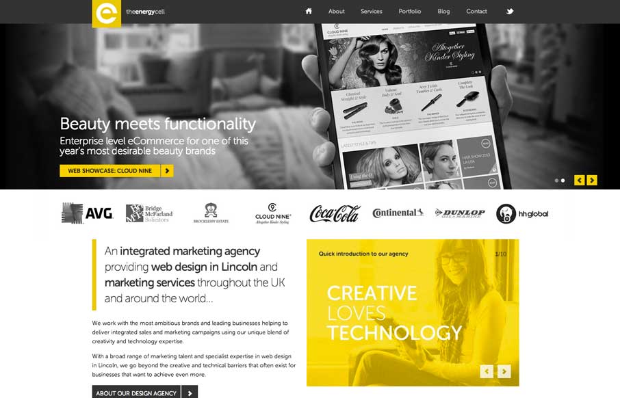
Nice looking adaptive site. I like the yellow and black palette. My favorite part is the lower 3rd of the page, the grid and blockiness of the layout works really well there.

by Aaron Griswold | Apr 15, 2014 | Design Firm, Gallery
Similar design patter at work, with the big hero area and the sliding into place main navigation. I like the slight transparency to that main nav on this site and the icon work is beautiful.
