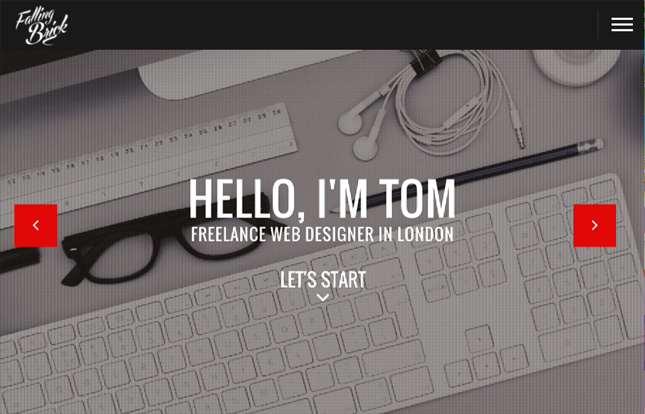
by Gene Crawford | Jul 12, 2016 | Gallery
Pretty different vibe for the layout on the FallingBrick website. I find the placement of the “hamburger” nav item real interesting. I’d be super curious to see what kind of influence placing that in the center of the “header” area would...
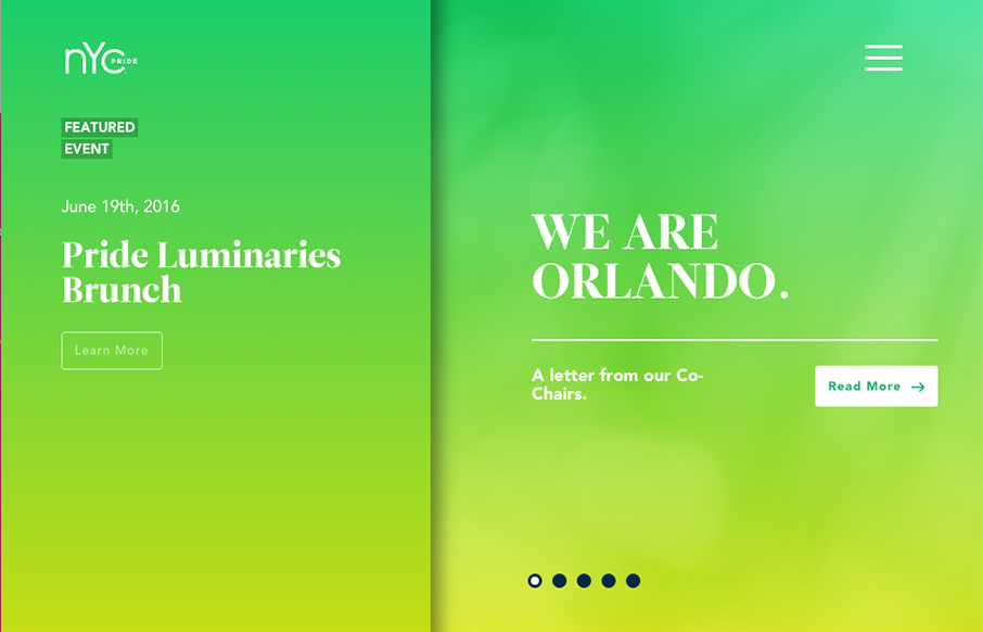
by Gene Crawford | Jun 24, 2016 | Gallery, Social Cause
Really unique website experience here for the NYC Pride site. I really really love how it’s a wholly different experience for desktop vs. mobile. Literally different styles of interaction. I dig the monochromatic color palette a great deal too. The overlay nav...
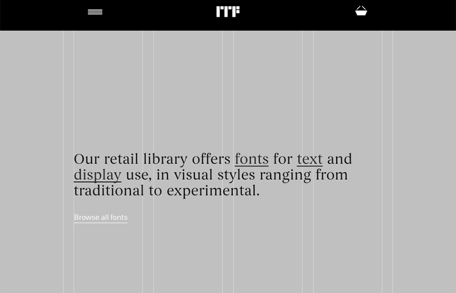
by Gene Crawford | Jun 23, 2016 | Design Firm, Gallery
Super cool, at first glance, standard looking website design. As you scroll around and start checking things out, you get hit with some pretty cool little interactions. Like the mouse overs and then those fly-out nav items on the cart and login. Super cool way to...
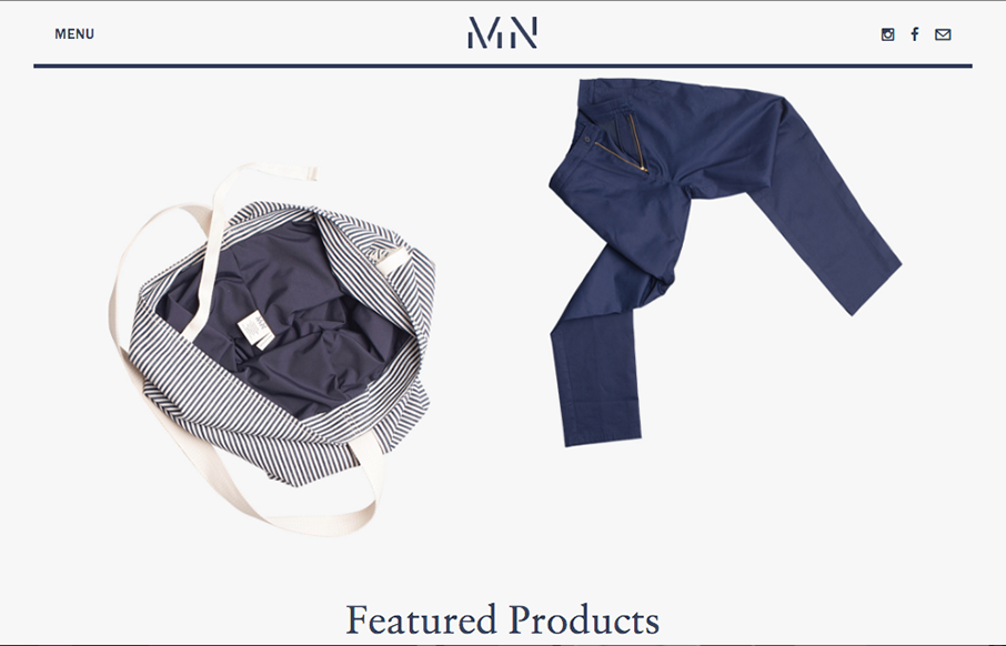
by Gene Crawford | Jun 22, 2016 | Fashion, Gallery
Pretty cool angle on some now-standard design patterns. I love how the header has that line and everything perfectly scroll-folds up into it. Then the menu is cool, all the lines and blockiness of it make it feel really fresh to me.
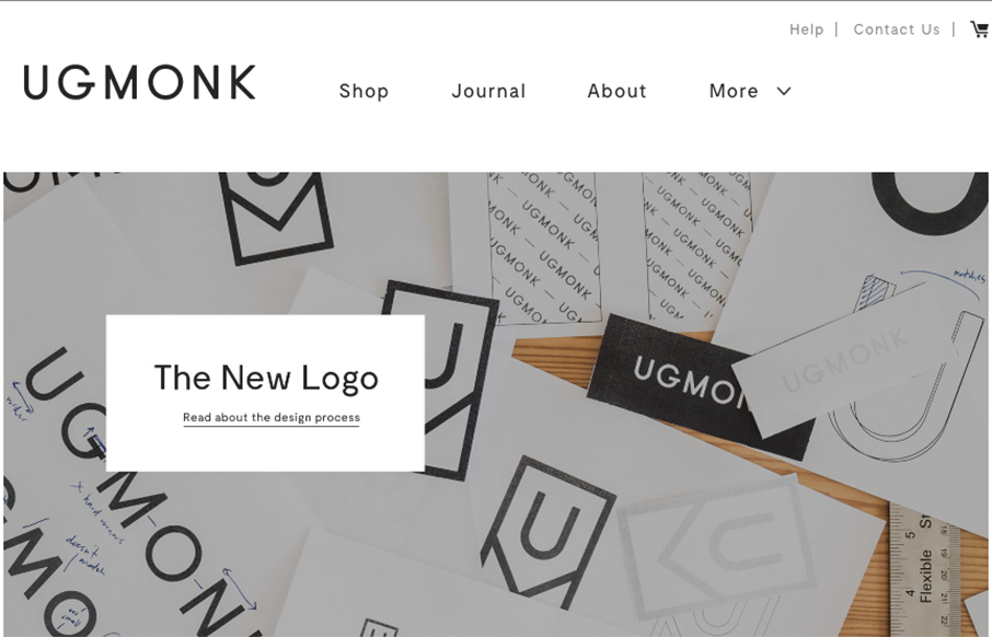
by Aaron Griswold | Jun 21, 2016 | Gallery, Product
So our friend Jeff Sheldon at Ugmonk has a new site and logo. (Jeff spoke a ConvergeSE a couple of years ago) Very cool to read where the changes in business and design come from as your company grows, and grows up. Great article here from Jeff about all of it....