
by Gene Crawford | Nov 19, 2012 | Design Firm, Gallery
Bold colors and simple copy help sell this company even if I can’t speak the language. It’s a nice simple yet bold interaction design that has a nice feel to it. I like the little contact envelope that rolls out to be more info in the bottom right the...
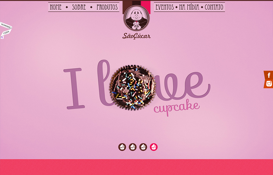
by Gene Crawford | Nov 16, 2012 | Food and Beverage, Gallery
Bold colors and interactions make up this great website for Saocucar. Nice fixed header/nav and bold colors for each section are matched with strong typography to make for a compelling visual treat as you make your way to the bottom of the page.
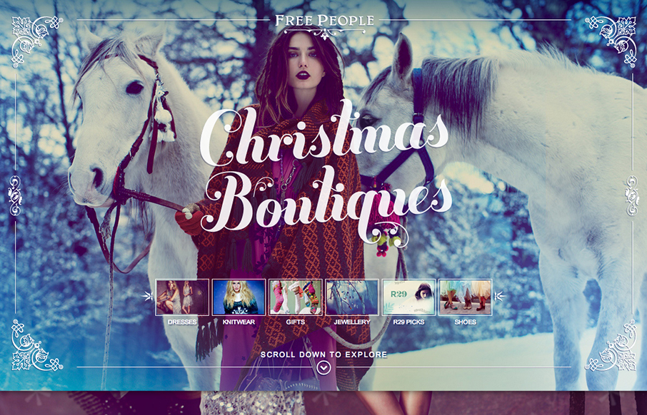
by Gene Crawford | Nov 15, 2012 | Gallery
Using a scrolling page with a parallax design isn’t new but I really love how this page is using those same tools. The little screen shots front and center really help to drive you to a section of the page, you just can’t help but click on them. Then the...
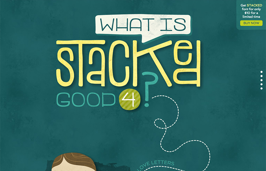
by Gene Crawford | Nov 15, 2012 | Gallery
Great site showing off the font in question. Stacked Font, it’s fun and super easy to take in. I like the long scrolling page format that let’s you explore as you make your way down. Fun!
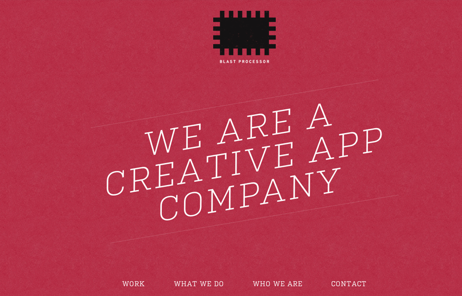
by Gene Crawford | Nov 14, 2012 | Gallery
I love the red color and texture used for the main intro section and header for the Blast Processor site. I also like how the header slides into a fixed position and at the same time the main nav slides to the right. Overall a nice clean layout that works well in most...