by Gene Crawford | Apr 23, 2014 | Gallery
Neat illustrations down the page. I really dig the rhythm of the page too, there are some sections that are “scroll hijacked” but overall I like it. Neat looking contact form area near the bottom of the site too.

by Aaron Griswold | Apr 22, 2014 | Gallery
When I first looked at the site, I thought, hmm.. that’s a little too simple – one picture, no scrolling.. what gives. Then I clicked on the navigation and realized it’s a different spin on the single page website that is real trendy lately. Instead...
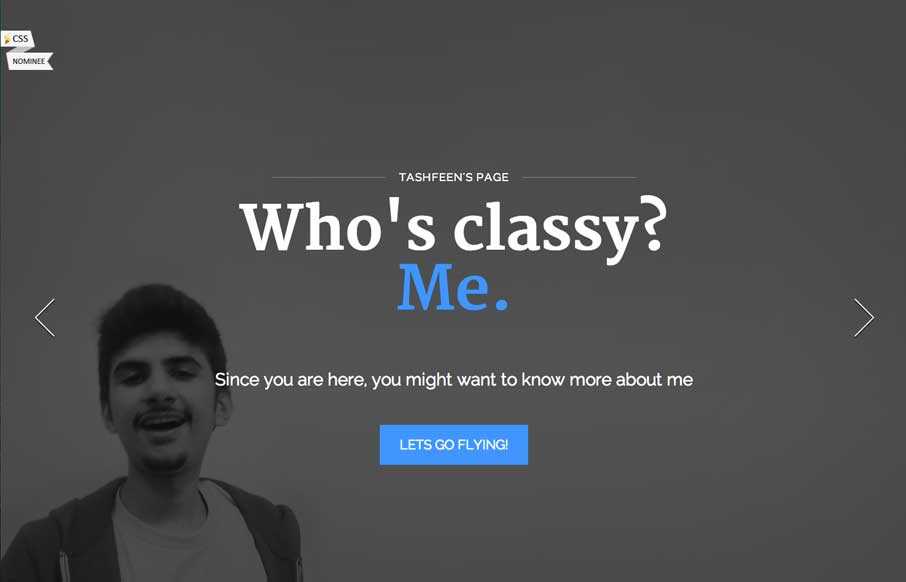
by Gene Crawford | Apr 17, 2014 | Gallery, Portfolio
There is a lot of content to take in on this site, from the topmost slider images, to the section animations, down to the timeline design. I really dig the effort put into making this site feel filled out and visually rich.

by Gene Crawford | Apr 17, 2014 | Gallery
I’m not wild about the loading animation on this site but I freaking love the page transitions. Very clever and very unique when you compare it to other web dev shop’s sites.

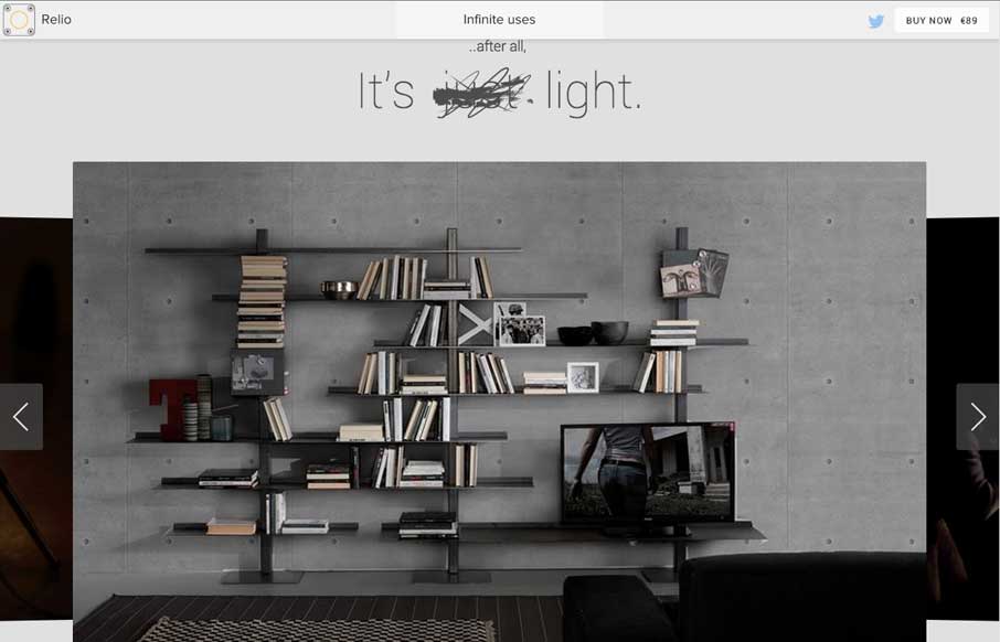
by Gene Crawford | Apr 16, 2014 | Gallery
I love the different screen width designs for Vox. There’s plenty of transitional differences for different devices. Go there and slide your screen around and check it out.