by Gene Crawford | Mar 15, 2016 | Gallery
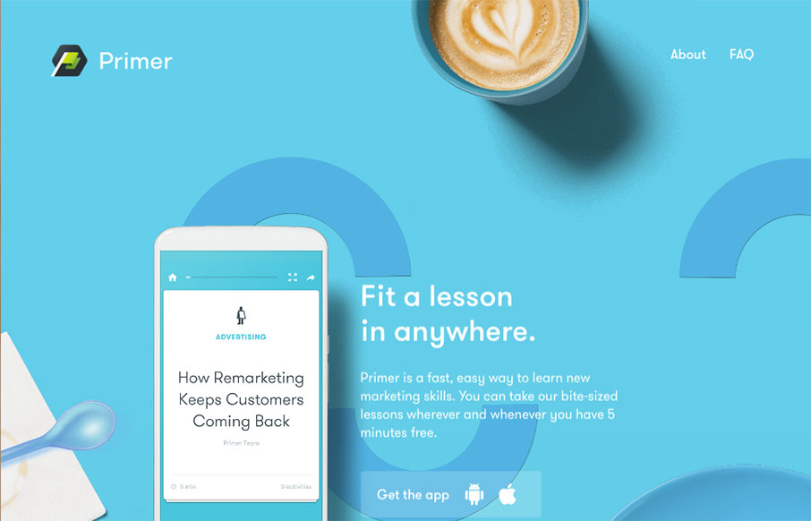
Yeah, yeah, scroll-jacking and all that. I know i’ve complained about it myself too. But this is a fairly beautifully designed website. I like a ton of the details in play here. Solid design on top of a bad paradigm, I still find it enjoyable.

by Gene Crawford | Mar 14, 2016 | Gallery, Portfolio
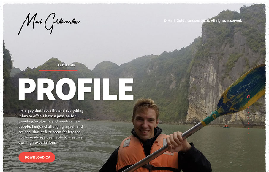
Nice portfolio website. It functions almost like a power point would, with big screens you move between. In that aspect I like the simplicity of the approach. What do you guys think? Does that work for you here?

by Gene Crawford | Mar 8, 2016 | Gallery, Portfolio
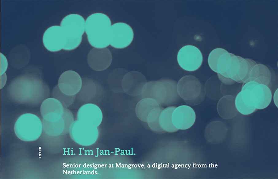
Really simple approach but very effective. I dig the simple links and the way all the sections are tied together with simple colors and then interactions. Straight forward works for me!

by Gene Crawford | Mar 3, 2016 | Gallery
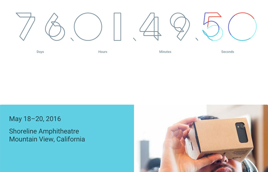
Google i/0 2016 site is up. I love the main countdown numbers and the way the sub sections kind of box in under it. It’s kind of a coming soon page, so maybe not fair to review it just yet. But it is pretty cool.

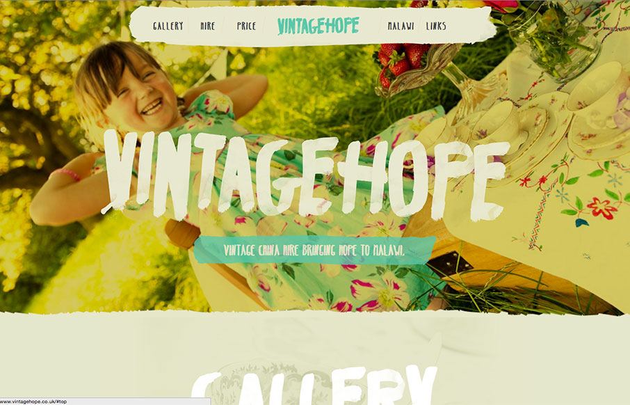
by Aaron Griswold | Mar 1, 2016 | Gallery, Nonprofit
Great typography work on the Vintage Hope site out of the UK. Looks like you rent fine china for different events, and the money goes to a children’s home in Malawi – good social entrepreneurial concept – and a nice looking site.
