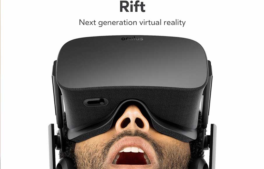
by Aaron Griswold | Jun 22, 2015 | Gallery
Boom. Sometimes that is just what you should say with a site review. Boom.
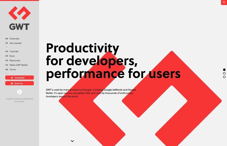
by Aaron Griswold | Jun 17, 2015 | Gallery
Fairly straightforward design here. Clearly an informative experience, much like a book. The mobile view isn’t that spectacular but it doesn’t really have to be. I like the interaction on the search in the top right a lot.
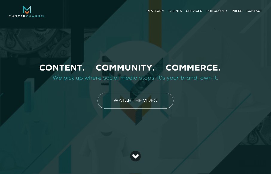
by Aaron Griswold | Jun 16, 2015 | Gallery, Music
When we were in Nashville last week for BDConf, I walked into a concert for one of Master Channel’s clients, (no, not R5 with Ross Lynch from Disney’s Austin and Ally… which my kids watch..) but country star, Kip Moore. And yes, I used the website...
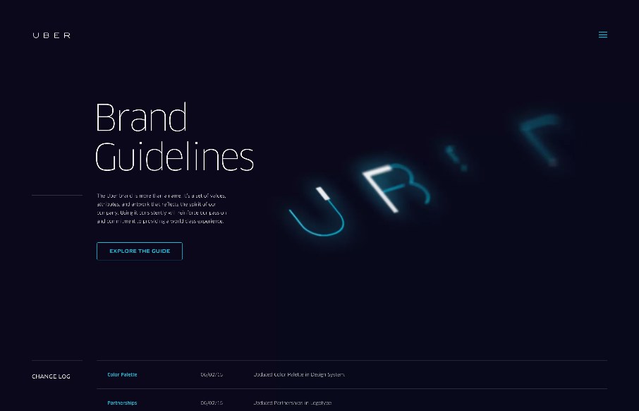
by Aaron Griswold | Jun 16, 2015 | Gallery
Always interesting to see brand / design / style guidelines from companies and products you use on a daily basis, like this one from Uber. Very clean and minimal, but with a few little interaction pieces – you can see they’ve taken time to make this...
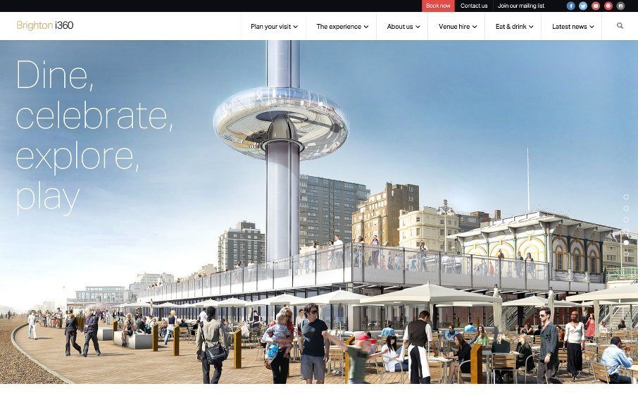
by Aaron Griswold | Jun 11, 2015 | Gallery, Travel
Starting to really enjoy things and sites coming out of Brighton, like this one for Brighton i360. Good grid-centric design – clean and simple. Looking forward to it being built and visiting.. next time I’m in the UK. @TheBrightoni360 made...