
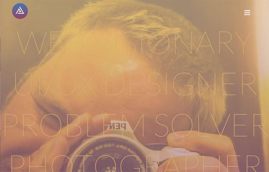
by Gene Crawford | Nov 16, 2015 | Design Firm, Gallery
What a great vibe this site design gives off. I love the structured yet disparate looking sections. The way the logo overlaps the scrolling content is visually intriguing as well. Strong stuff.

by Gene Crawford | Nov 16, 2015 | Gallery
Pretty nifty fixed nav design. I dig the colors and simple approach too. Good stuff. A modern website design that was recently made for BYBE, the design incorporates a slide bar menu that provides users with a different experience, away from the typical mainstream...
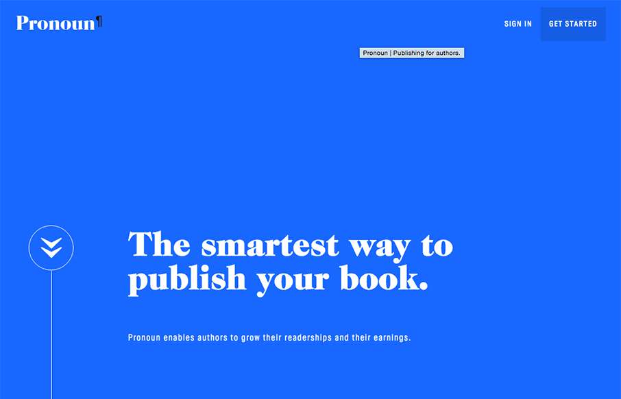
by Gene Crawford | Nov 16, 2015 | Gallery
Beautiful website. I luuuurve the big type based sections and the strong/bold colors. The way you scroll mostly acts like a slideshow, which works in this instance. Then the big reveal of the logo at the bottom is killer.
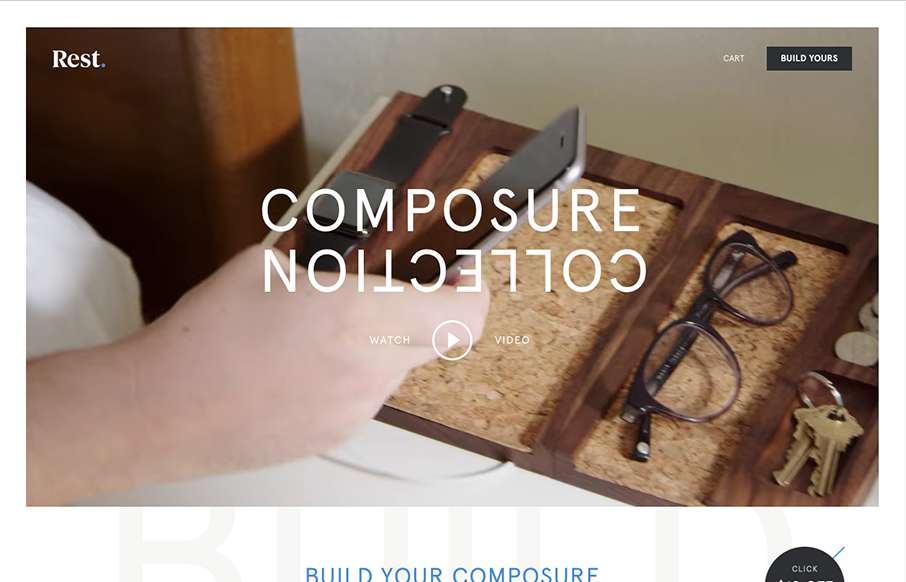
by Gene Crawford | Nov 12, 2015 | Gallery, Product, Shopping
Everything has it’s place. Just like with the product the website for the product has the same vibe and tone. I like the way they show off each different type of product and when you hover over them you can see people’s stuff on it. The website is very...
by Gene Crawford | Nov 12, 2015 | Gallery
Very thoroughly done website design for this portfolio site. I love the look and feel from top to bottom. The subnav flyaway is pretty cool and I love the “card” part for the work section. Brilliant work.