by Gene Crawford | Mar 6, 2014 | Gallery
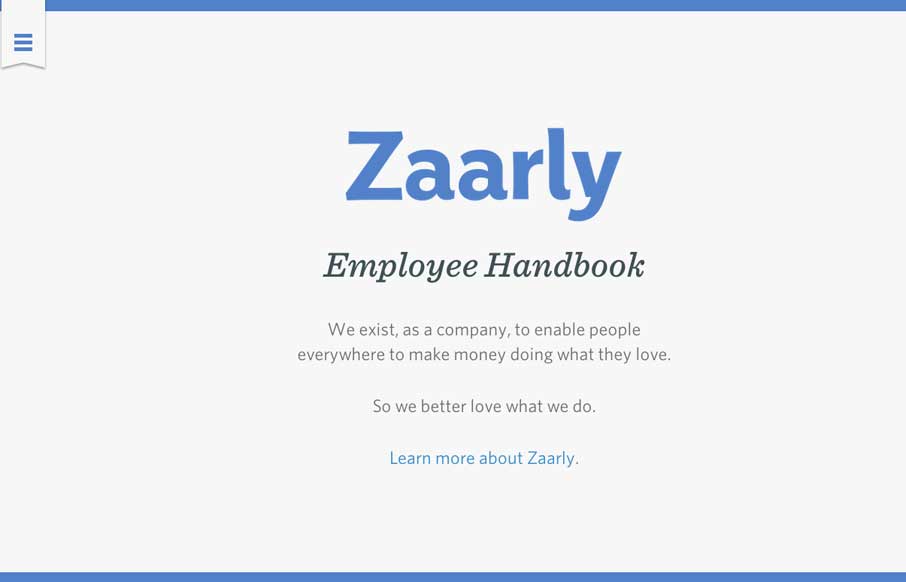
Nothing super rule breaking about this but it’s become commonplace for companies to put things like their employee handbook or benefits info on a website or resource like that. The Zaarly Employee Handbook is just sexy. Nothing more needed to say about it other...
by Giovanni DiFeterici | Mar 5, 2014 | Food and Beverage, Gallery
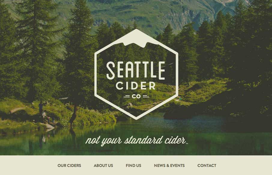
The Seattle Cider Company website uses flat illustrations and simple interactions to control the narrative of the cider making process. The design style is hip and minimal with a few nifty tricks (like the slide-in fixed nav) and a lot of character. The narrative...
by Aaron Griswold | Mar 5, 2014 | Gallery, Marketing
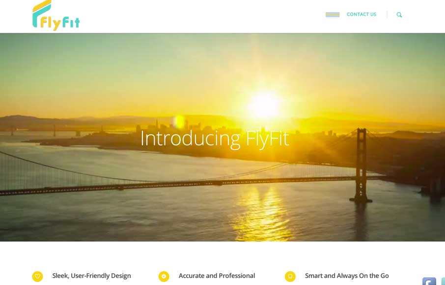
This is a fast loading video based site that was made for a large screen. It has subtle parallax elements that don’t detract from the main video feature of the site. They could probably go with a cleaner social media linking system, but since it’s a new...
by Giovanni DiFeterici | Mar 4, 2014 | Gallery
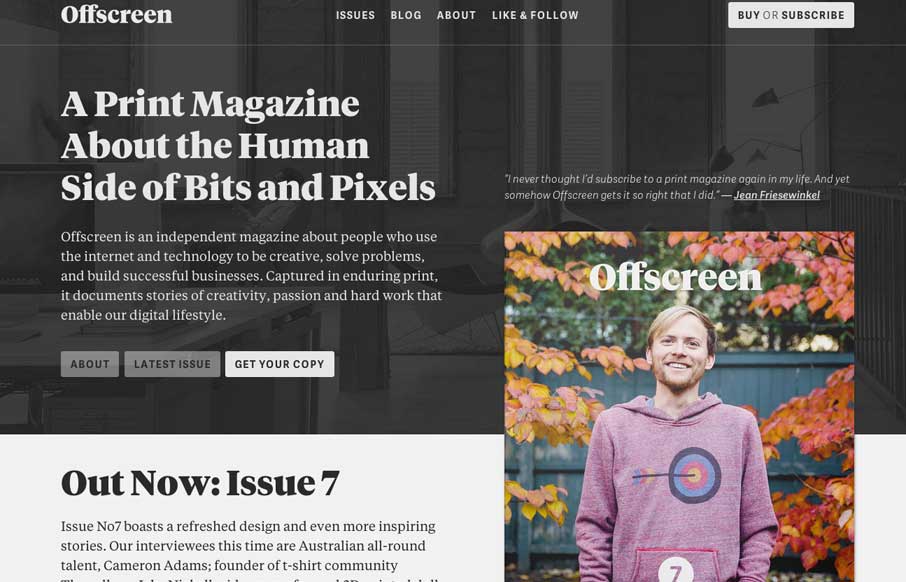
Offscreenmag.com looks great at all screen sizes. I really enjoy the balance of the typography and soft grays. The site does a great job of balancing a lot of information with a minimal design language. Simple and elegant. We get the mag and that’s nifty too....
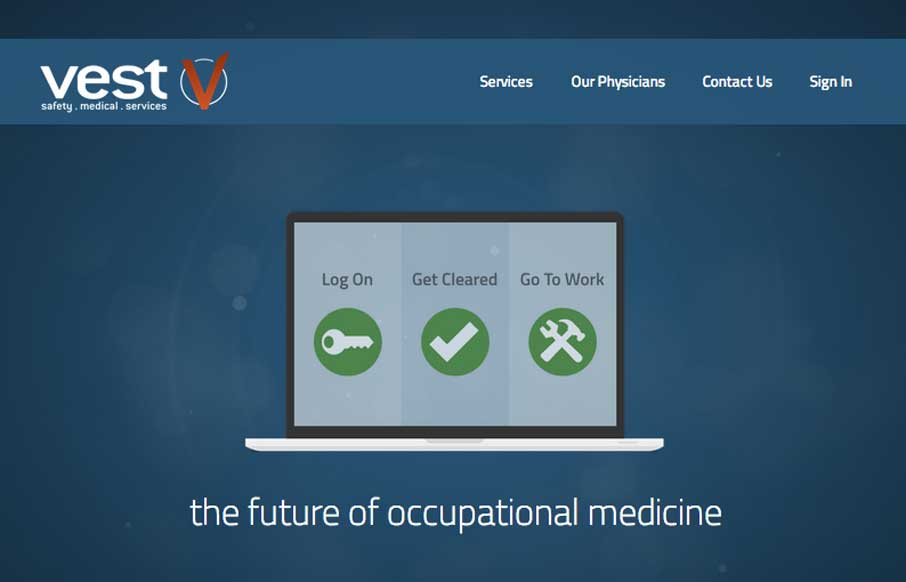
by Giovanni DiFeterici | Mar 3, 2014 | Gallery, Medical
Vest provides a really nice loading experience, considering it is a site that transfers 1.4MB when loaded. The main view loads a simple graphic and then loads in the heavier images whenever they are a available. The effect is something like a load screen that...
