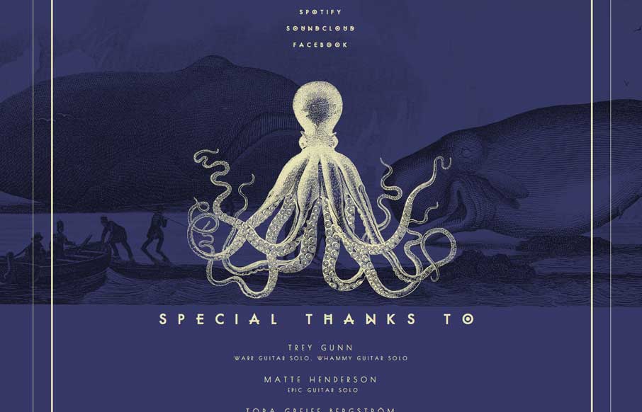
by Aaron Griswold | Apr 3, 2014 | Gallery, Music
Really beautiful single page site for this band. I luurve the illustrations.

by Aaron Griswold | Apr 3, 2014 | Gallery
Pretty nifty site design. I like how the main nav stays fixed but in the box shape that overlays the site. Also, resize this badboy, that’s a cool way to hide the transitions but also making it interesting for us that build sites too. Bravo.

by Maria | Apr 2, 2014 | Gallery
Clever app. It’s a simple page for the app but I really dig it. I like the iPhone image that changes out and slides up slightly as you scroll down the page.
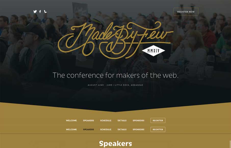
by Aaron Griswold | Apr 2, 2014 | Conference, Gallery
The new Made By Few site for 2014 is marvelous. The lineup is looking good too. I really dig this design pattern where the top of the page is used for a big hero area and as you slide down the page the main nav sort of sticks into place and is set. This site does that...
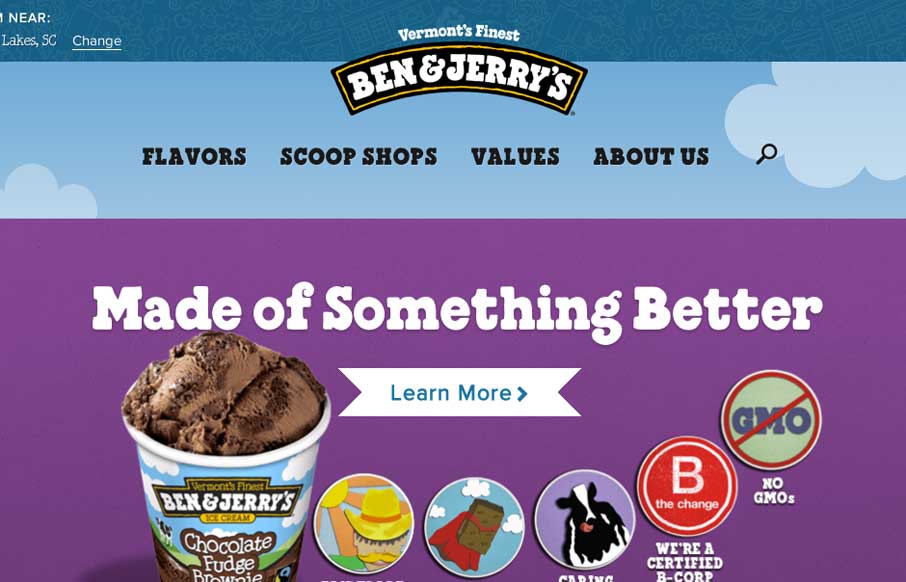
by Gene Crawford | Apr 2, 2014 | Food and Beverage, Gallery
The new Ben & Jerry’s site, done by Happy Cog is super nice. But there’s more here than just a pretty face. There is a ton of strategy behind it and you can feel it as you use the site. Mmmmm Ice Cream…. They have a pretty epic case study and a...