
by Aaron Griswold | Apr 15, 2014 | Gallery
Little details make the site. I like the little movement the down arrow has, just to let you know it’s there. Then the little paper airplane on the contact button is nice.

by Aaron Griswold | Apr 15, 2014 | Design Firm, Gallery
Similar design patter at work, with the big hero area and the sliding into place main navigation. I like the slight transparency to that main nav on this site and the icon work is beautiful.

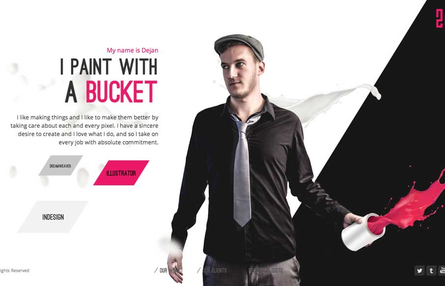
by Aaron Griswold | Apr 14, 2014 | Gallery
Nice minimal approach to the HARBR Co site design. I like the “menu” link and how that interaction works. It helps to keep the site clean and focused.
by Aaron Griswold | Apr 14, 2014 | Gallery
Sometimes you’re presented with something completely different, like in the case of the 2che website. When you start to scroll you go right to left and there’s a sort of horizontal parallax (which is the original direction right?) going on. It’s not...
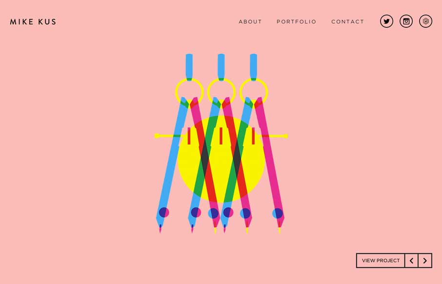
by Aaron Griswold | Apr 11, 2014 | Gallery
There’s nothing quite like a simple beautifully designed website. Mike Kus nailed it.