by Gene Crawford | Apr 17, 2014 | Gallery, Portfolio
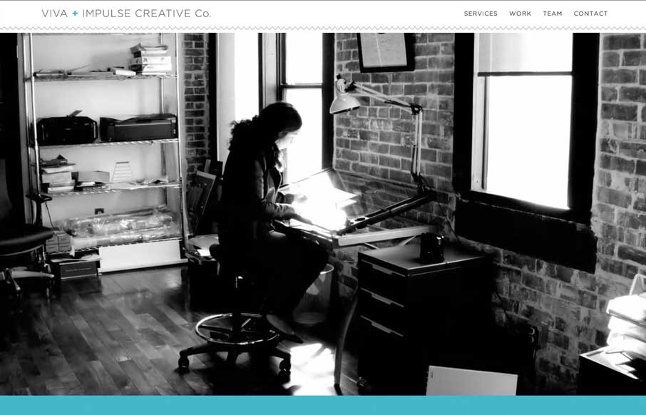
There is a lot of content to take in on this site, from the topmost slider images, to the section animations, down to the timeline design. I really dig the effort put into making this site feel filled out and visually rich.

by Gene Crawford | Apr 17, 2014 | Gallery
Here’s a similar visual formula for a layout but there’s a slight difference to this site with the light line work and icon designs. I dig it.

by Gene Crawford | Apr 16, 2014 | Gallery
I love the different screen width designs for Vox. There’s plenty of transitional differences for different devices. Go there and slide your screen around and check it out.

by Gene Crawford | Apr 16, 2014 | Gallery
Nice looking adaptive site. I like the yellow and black palette. My favorite part is the lower 3rd of the page, the grid and blockiness of the layout works really well there.

by Aaron Griswold | Apr 15, 2014 | Gallery
Little details make the site. I like the little movement the down arrow has, just to let you know it’s there. Then the little paper airplane on the contact button is nice.
