
by Aaron Griswold | Dec 5, 2014 | Gallery, Travel
Dude… where was this site when my wife and I were living and traveling in Australia, South East Asia, and Europe – sans kids? This is awesome visual representation of peoples “bucket lists” – from skydiving to climbing Mount Kinabalu in...
by Aaron Griswold | Dec 5, 2014 | Gallery
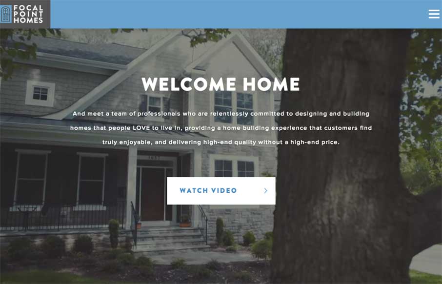
Who knew that you can make a real estate website that looks good and is functional (most of the builders and agents in our area have the worst websites ever… really.. we just bought a new home a few months ago, so I’ve seen them all) Focal Point Homes out...
by Aaron Griswold | Dec 5, 2014 | Gallery
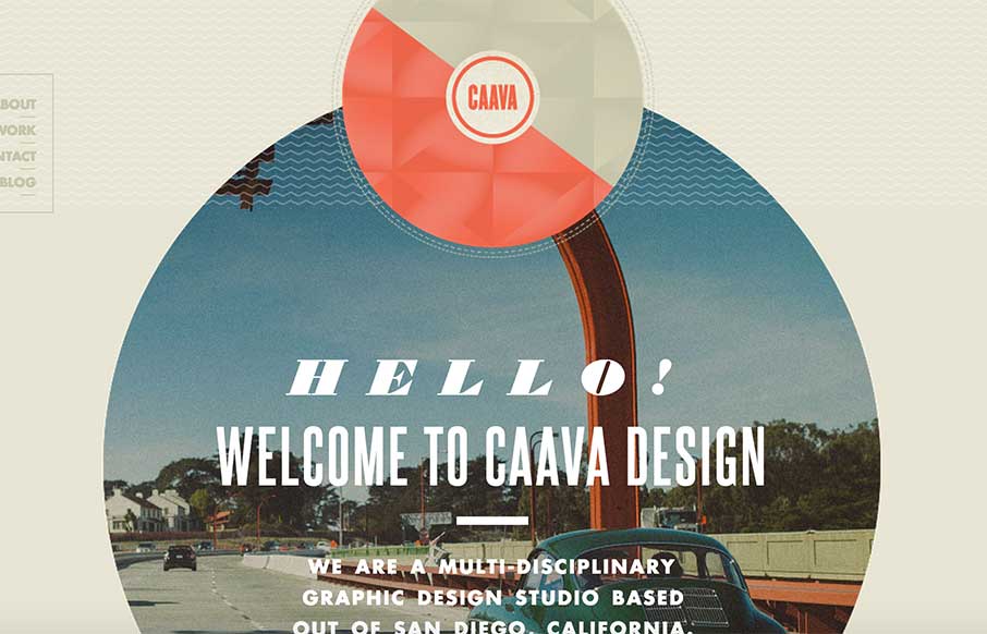
Great single page agency site from Caava Design out of San Diego, California. While I wish it were responsive, I love the layout and coloring – an neat trick with the arrow coming down on scroll to highlight the Featured Work area.

by Aaron Griswold | Dec 4, 2014 | Gallery
Great looking site from Amazee Labs out of Switzerland. Like how they carried the tape pieces theme through out the site – all the way to making new social media icons in the same theme (from their team detail pages). Plus – I accidentally found their 404...
by Aaron Griswold | Dec 4, 2014 | Gallery, Software
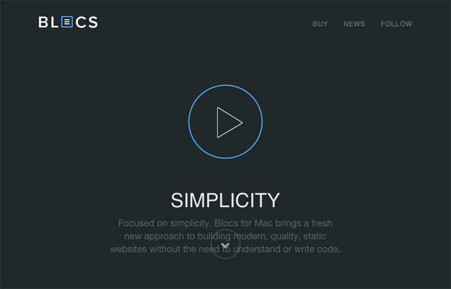
If you’ve read any of my reviews – then you’ll probably notice that the word “simple” comes up about every other review. Simple is a term of endearment in my world, because for me, it means cutting to the core / heart / bones – and...