
by Gene Crawford | Sep 7, 2016 | Gallery, Portfolio
Pretty fun personal/portfolio site for Michael Ngo. I really love the video loop and then the feet at the bottom. 🙂 Pretty sweet graphic design flourishes too.
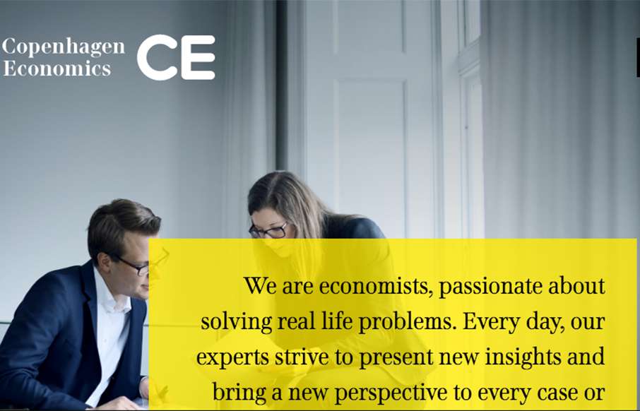
by Gene Crawford | Sep 6, 2016 | Gallery
Solid grid, solid typography and a really great vertical rhythm. The Copenhagen Economics website is beautiful from top to bottom. The mobile screen view is just as solid too. Check this one out for sure.

by Gene Crawford | Sep 6, 2016 | Gallery
Really cool looking design for Scrooser. I really like the detail on the “order now” button. The interaction there to break it out into two buttons for “order” and “ride” is really clever, it makes you focus on it and notice it. It...

by Gene Crawford | Sep 2, 2016 | Gallery
Nothing earth shatteringly brilliant here, but it’s just a great example of simple and straightforward good working design. I love the illustration work and the overall approach. Solid.

by Gene Crawford | Sep 1, 2016 | Food and Beverage, Gallery
Brilliantly simple website. Bold typography that’s easy to get around on. The menu is in a PDF format, which isn’t 100% perfect, but I totally get why it’s like that. It still all works seamlessly enough.