
by Gene Crawford | Feb 3, 2015 | Gallery
I like the monochromatic approach to the color and the simple line art icons give it a good vibe. I also like the way the header is treated visually as you scroll down a bit.
by Gene Crawford | Feb 3, 2015 | Education, Gallery
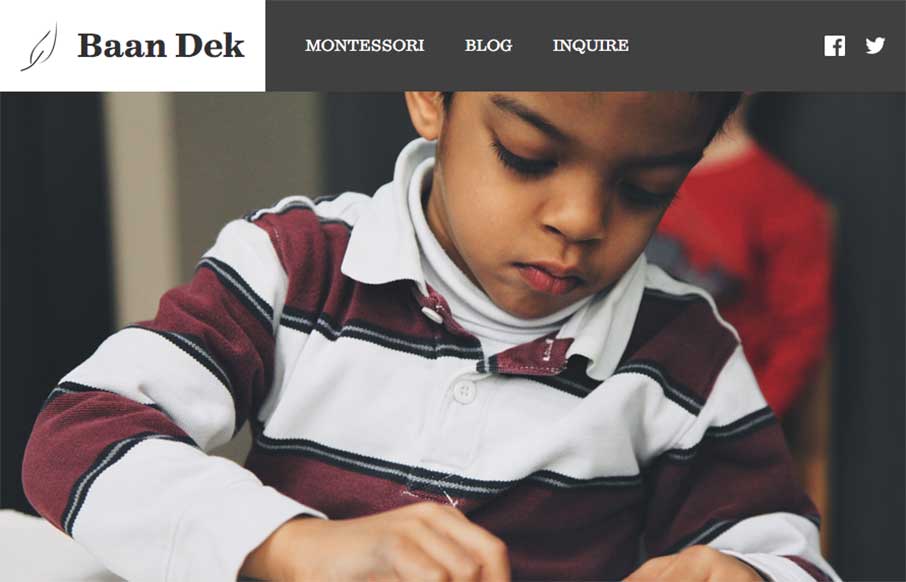
Simple and straightforward the Baan Dek site is. I like the oversized imagery and the simple layout. Solid responsive design and minimal page count make this a pretty easy to digest website. Bravo for their brevity. Submitted by: Bobby George @baandek Role:...
by Aaron Griswold | Feb 2, 2015 | Gallery, Software
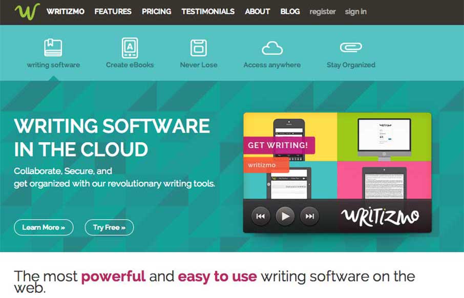
I like how Writizmo went with their main content in the hero area. The marketing messages / feature lists that a lot of web apps use are normally in a long scroll below the fold, or in a rotating barrage / slideshow that no one really looks at…( just...
by Aaron Griswold | Feb 2, 2015 | Gallery, Portfolio
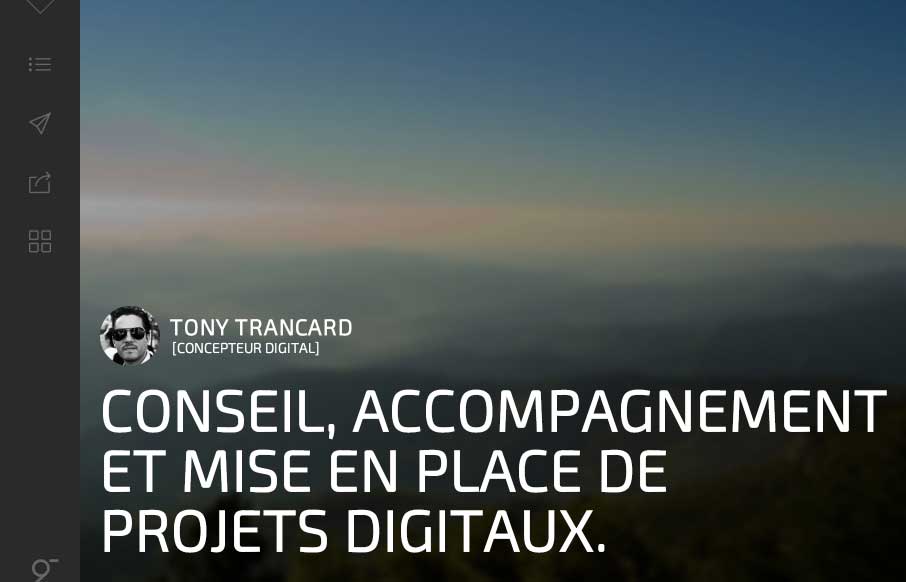
It took me a minute to get into Tony Trancard’s portfolio site (out of France), because it was a little deceiving at first. The large image with the mostly text and gray below threw me off. But then I remembered that there was vertical navigation, and anyone...

by Aaron Griswold | Feb 2, 2015 | Gallery
I was reading back though an article we published about Web Design Trends for 2015, and realized that Josh Hemsley’s company out of Californina, Envoy just produced a website, Blossom that fits in well with the upcoming trends: The Blossom site has great,...
