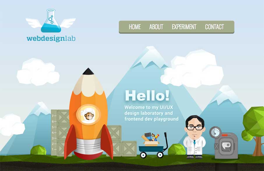
by Aaron Griswold | Feb 10, 2015 | Gallery, Portfolio
I like this one (ok, two) pager. It’s fun and has a cool concept. Cool illustrations and even some CGI on the rocket (well, kind of). And no.. not that Carls Jr. From the Designer:This is my portfolio site to showcase my design work. Hopefully it can be approve...
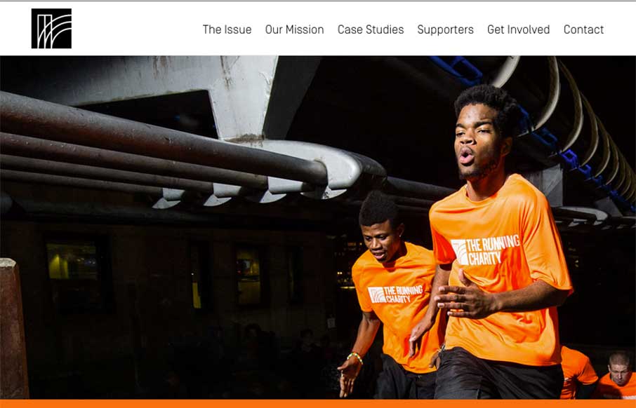
by Aaron Griswold | Feb 10, 2015 | Gallery, Nonprofit
Some of us at Unmatchedstyle are runners. In fact, Gene and I are running a 12k this weekend that benefits the state forest we run a couple times a month. The Running Charity, out of London, is taking running and charity to a different level, not just raising money...
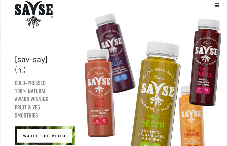
by Aaron Griswold | Feb 9, 2015 | Food and Beverage, Gallery
Pass the kale and beetroot, time for something good! Whether you like great tasting fruit and veggieGreat one-page site for Savse (sav-say) Smoothies done by NEVERBLAND out of London. Like using the animated SVG to transition from above the fold to below. The link to...
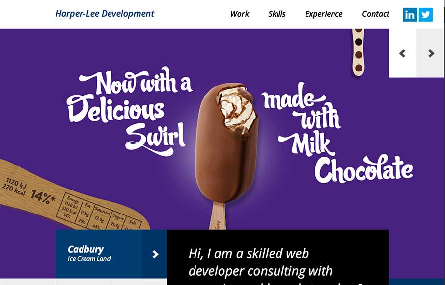
by Aaron Griswold | Feb 9, 2015 | Gallery, Portfolio
No – not that Harper Lee (who is releasing the sequel of To Kill a Mockingbird this year) – but Martin Harper-Lee is doing some pretty decent work too. Like how the home page has no scrolling, and instead of a traditional slideshow, he has used canvas to...
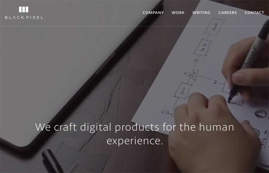
by Aaron Griswold | Feb 6, 2015 | Gallery
I have a new weather app because of the Black Pixel agency out of Seattle, Washington (The Funny or Die Weather app from Will Ferrell’s company). Black Pixel did the redesign. They also redesigned their website, which is pretty awesome, design-wise, and every...