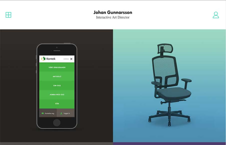
by Gene Crawford | Mar 4, 2015 | Gallery, Portfolio
Something about a classic looking simple design. Johan’s portfolio website has “it”. I dig it greatly! Submitted by: Johan Gunnarsson @nahoj Role: Designer

by Aaron Griswold | Mar 4, 2015 | Design Firm, Gallery
Cool and kind of trippy agency site out of Belgium, from tix02. The scroll is reversed, and the Work section through me off guard for a second; but it’s definitely unique in it’s design, and should stand out to potential clients. I really like the section...

by Aaron Griswold | Mar 3, 2015 | Gallery
Dynamic and bold design from Nivas out of Croatia. The multi-hued chevrons really make this site – and the line art illustration is a great background to start the page. Also like the Work page, and how the chevron shape is included in the work portfolio.

by Aaron Griswold | Mar 3, 2015 | Design Firm, Gallery
I was looking up some information on one our ConvergeSE speakers – Adam Smith – and took a look at his company’s website, a Wilmington, NC based firm – Wide Open Technologies. This is a solid site, that is clean and easy to follow. I especially...

by Aaron Griswold | Mar 3, 2015 | Gallery, Shopping
I really like this trend over the past couple of years of companies spending a little time summing up their year in a fun and interesting way. BigCartel has done that here with their 2014 “Cheers to Last Year”. SVG and illustration rich – and smart...