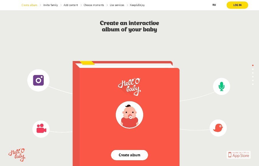
by Aaron Griswold | May 27, 2015 | Gallery
I wasn’t a fan of this app product page for Hell’o Baby at first. When we have a site submitted to us, we immediately check for responsiveness by pulling the browser left and right, checking for how the site resizes. Hell’o Baby at the iPhone view on...

by Gene Crawford | May 26, 2015 | Gallery
Strong grid design and some some solid/strong color makes this website shine for Frank Digital. I especially like the asymmetrical layout of the portfolio section on the home page. Designer: Frank Digital Sydney & Melbourne From the Designer: We create websites...
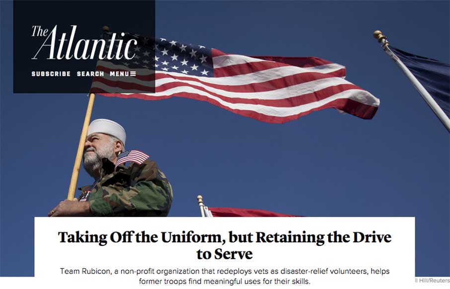
by Gene Crawford | May 26, 2015 | Gallery
The layout of The Atlantic is insanely simple. In many ways it mimics such things as say Instagram. It keeps me intrigued with headline after headline and super great photo after photo. I love this, just sitting here scrolling and reading and looking. Thing does...
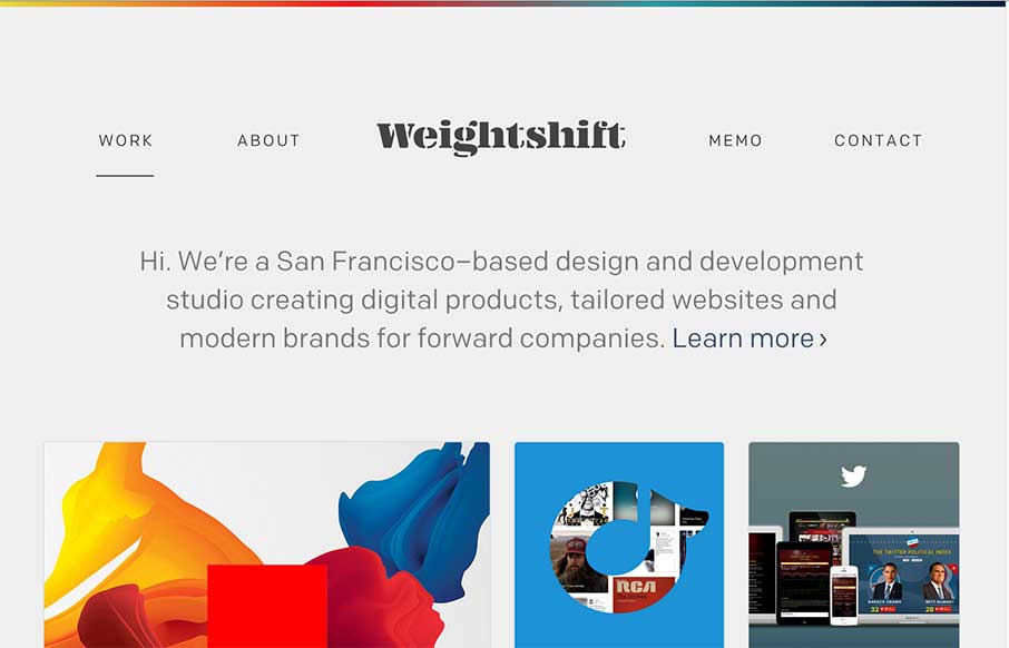
by Gene Crawford | May 20, 2015 | Gallery
Every now and then Weightshift will rework their website. I’m in love with this version for sure – not that the past dozen were not good by any stretch. I love simplicity and the way this site has traveled down that path over the years is a work of art....
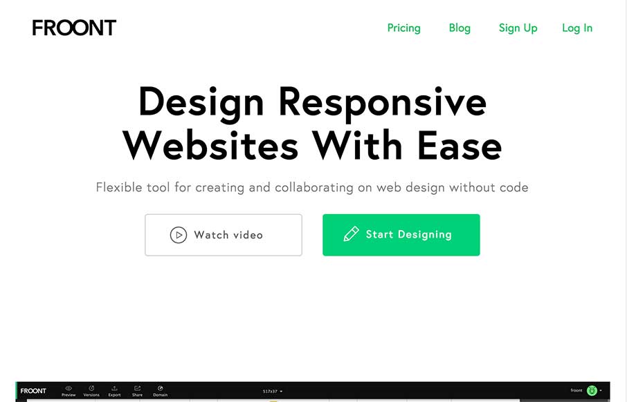
by Gene Crawford | May 20, 2015 | Gallery
I LOVE the Froont website design. Man those gifs are fantastic for explaining what the heck the app is all about. Then the Features and Pricing section on the home page is brilliantly designed IMHO. Love it, all the way.
