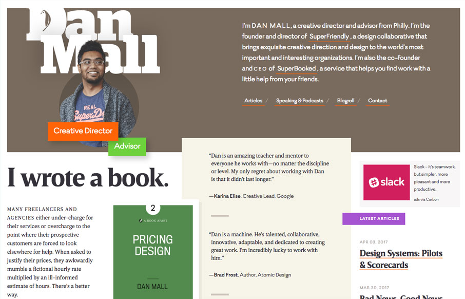
by Gene Crawford | Apr 26, 2017 | Gallery
Beautiful layout and design. I love the load-in animation, it sets up a fairly straight forward layout of visual elements in a really striking way. Crisp typography and color that help build a sense of contrast. Spend some time on this site if you can and learn.
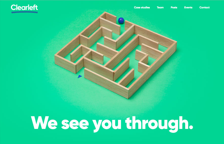
by Gene Crawford | Apr 25, 2017 | Gallery
The new(ish) ClearLeft website is live. What a cool yet simple approach. I love it. There’s some real beauty here in their approach. I particularly love the team page and the events page. Read Jeremy’s Launch Note too.
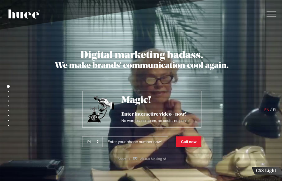
by Gene Crawford | Apr 24, 2017 | Gallery
Lots of stuff going on with this website for Huee. It’s pretty chock full of eye candy and movement, which should get many clients excited. I dig the background video of the lady pointing at the phone, pretty clever joke. The hamburger nav icon that opens up the...
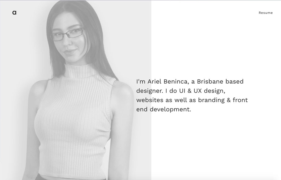
by Gene Crawford | Apr 24, 2017 | Gallery, Portfolio
Great portfolio website design for Ariel Beninca. I love the simplicity which makes you really notice the way the work is presented as you scroll down the page. There’s a very clean aesthetic here but just enough movement and fun to show off some skill....

by Gene Crawford | Feb 14, 2017 | Gallery
Good lord I love the Stripe website. Everything about it. It’s so visually dense with content and stuff but yet feels so light and airy. Yeah, I just said light and airy. 🙂 Seriously, you’ve probably spent most of your time with Stripe in the app or on...