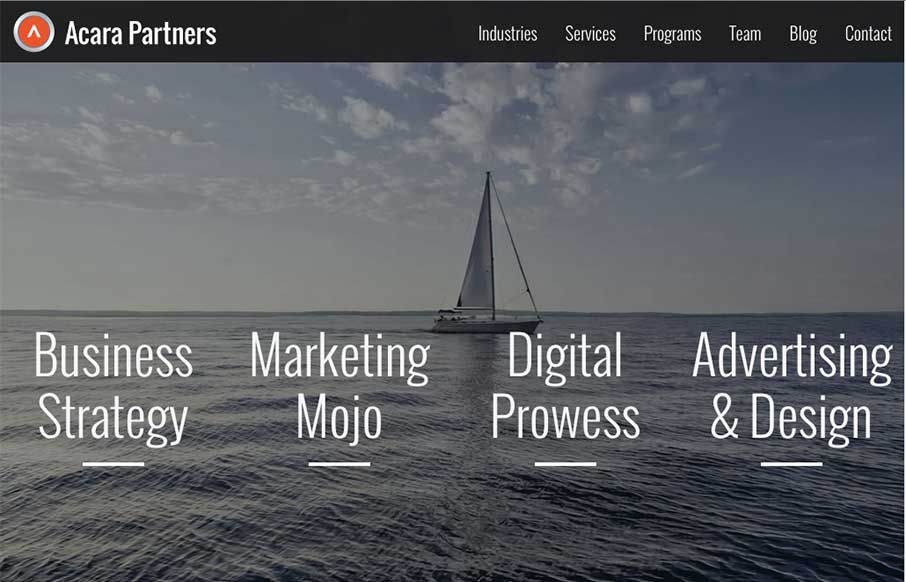
by Aaron Griswold | Mar 25, 2015 | Gallery, Marketing Company
I like how Acara Partners, out of Connecticut, uses their home page image background to be a secondary navigation – cutting straight to what they do. The site is text heavy and icon rich – and that works more for a biz strat / marketing company (their two...
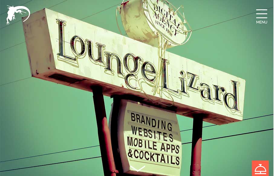
by Aaron Griswold | Mar 25, 2015 | Gallery
I’m glad Lounge Lizard out of NY and LA submitted their website to us. There’s a little bit of Don Draper in all of us (hopefully the good parts) – and that’s projected in LL’s website, along with good modern design. Like the block design...

by Aaron Griswold | Mar 25, 2015 | Design Firm, Gallery
We’re starting to see more and more one pagers – especially from start up agencies / freelancers. Pixenum out of Croatia is one of these sites, and it’s a good one. Good web design is not only about the look and feel – it should also be about...
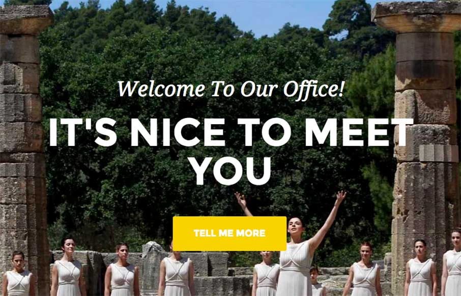
by Aaron Griswold | Mar 24, 2015 | Gallery, Travel
The Greek Tour Guide of Ancient Olympus is a simple site, but I think that’s why I like it – we don’t do enough simple. I was reading the copy of the site – and decided that you don’t need much more than this to get your point across...
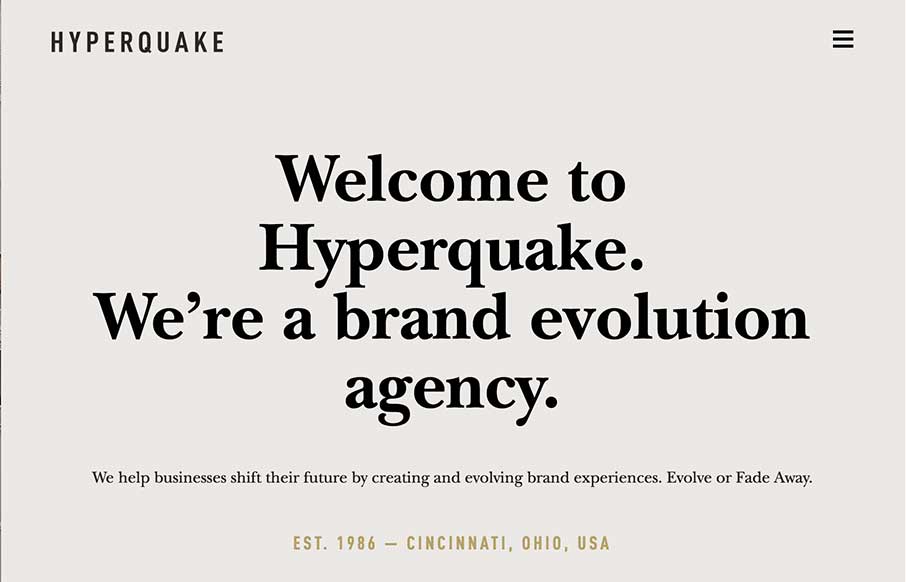
by Aaron Griswold | Mar 24, 2015 | Gallery
“Evolve or Fade Away” – strong motto from the Cincinnati based agency Hyperquake – strong site too. Good block design throughout the site makes it clean and crisp along with the color combination. Like the design aesthetic in their work too...