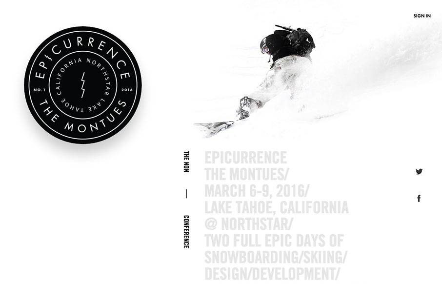
by Gene Crawford | Feb 8, 2016 | Conference, Gallery
Beautiful website for what I understand is a beautiful event. I love the ‘speaker’ pictures that slide in as you scroll down the page. The mobile view simply turns this off. A great mix of cool interaction and an almost minimal approach. Beautiful.

by Gene Crawford | Feb 8, 2016 | Gallery
New Uber. New Uber Logo. New Uber Website. Woot. I do like it a great deal.The large video/hero area is pretty slick, even if the contents are all perfect scenarios for the riders/drivers. My favorite part is the sections as you scroll down, those are some pretty nice...
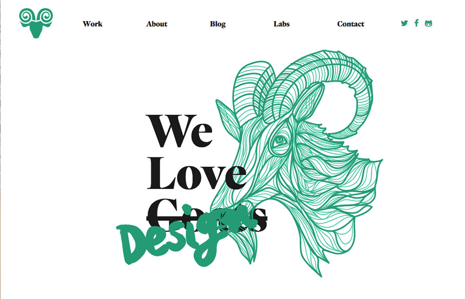
by Gene Crawford | Feb 4, 2016 | Gallery
Beautiful design & illustration work for Capra Design’s website. I love the asymmetrical layout to the main blocks as you scroll down the page too. Just about every detail has been handled with the design of this website, including the client intake process....
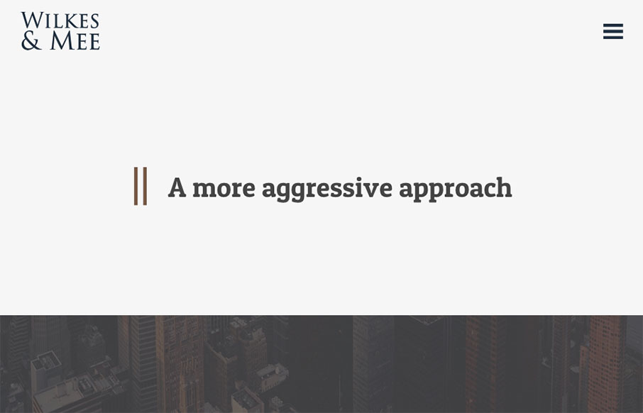
by Gene Crawford | Feb 4, 2016 | Gallery
I love minimal design, especially when I see it utilized for a client like this. It’s hard to convince them (typically) of the approach. This site is a great example of how it can work well in a real world scenario. Bravo Garrett. From the Designer: Modern and...
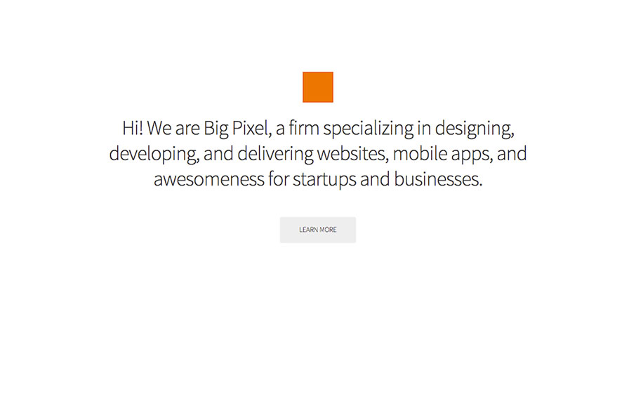
by Gene Crawford | Feb 3, 2016 | Gallery
We’ve seen this hero/image area pattern before, but I like the animation used in this one, it stands out to me. I also really dig the tight illustration work used down the page here. It’s also a single page layout which I like much for this application....