by Gene Crawford | Feb 11, 2014 | Gallery
Clever use of the “fold out nav” on the left side of the page. It has the interaction of being opened and closed but it doesn’t feel hidden for hidden’s sake, if that makes any sense… I like the responsive design details and the E.T....

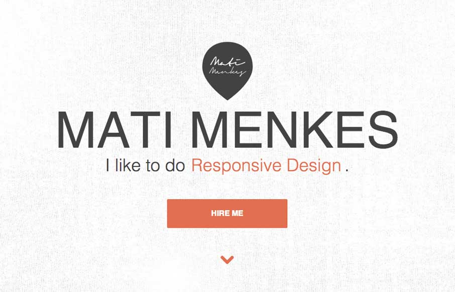
by Gene Crawford | Dec 12, 2013 | Gallery
I really dig the new Skookum website design. It’s very clean and professional feeling but also has a vibe that is counter to an overly technical appeal. There is just enough movement and little surprises tucked away here and there to keep a level of dynamism in...
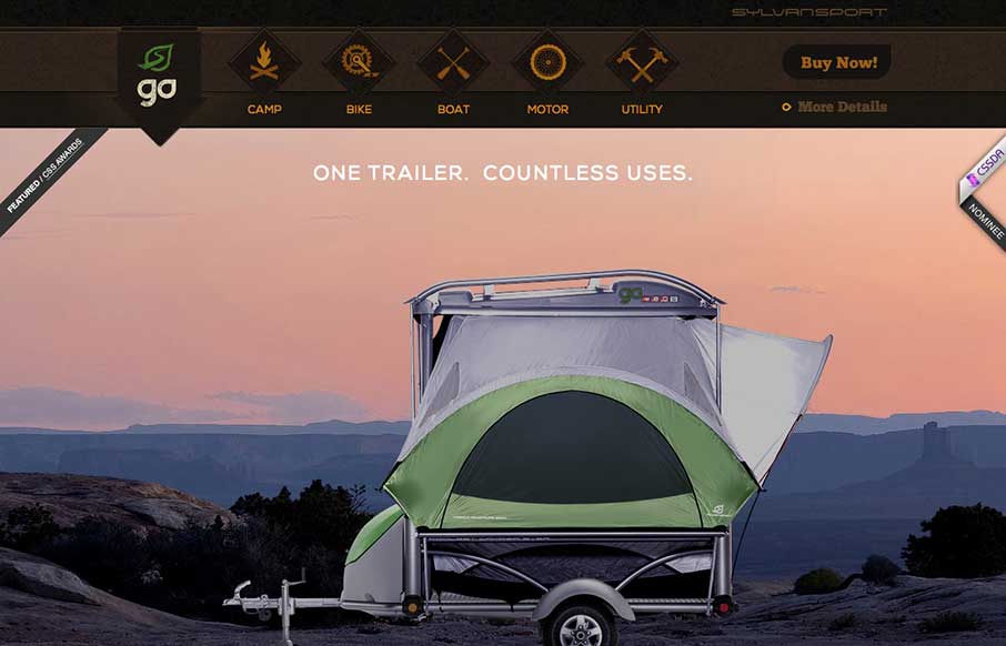
by Gene Crawford | May 16, 2013 | Gallery, Sports/Recreation
Submitted by: Justin Bernard @fleeangrybear Role: Designer & Developer Damn, I love detail like this. The slight parallax on each image of the products down the the animations on the main navigation before you scroll it to the fixed layout spot. Lovely. The...
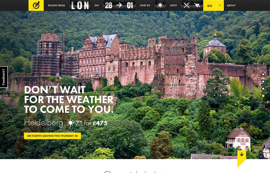
by Gene Crawford | Apr 18, 2013 | Gallery, Travel
I love the way the search is put together on this site. Human logic based or whatever you’d call that. Also the interactions are quite nicely done. The slight parallax on the main slideshow images is great and not overused and the photos are just brilliant. The...
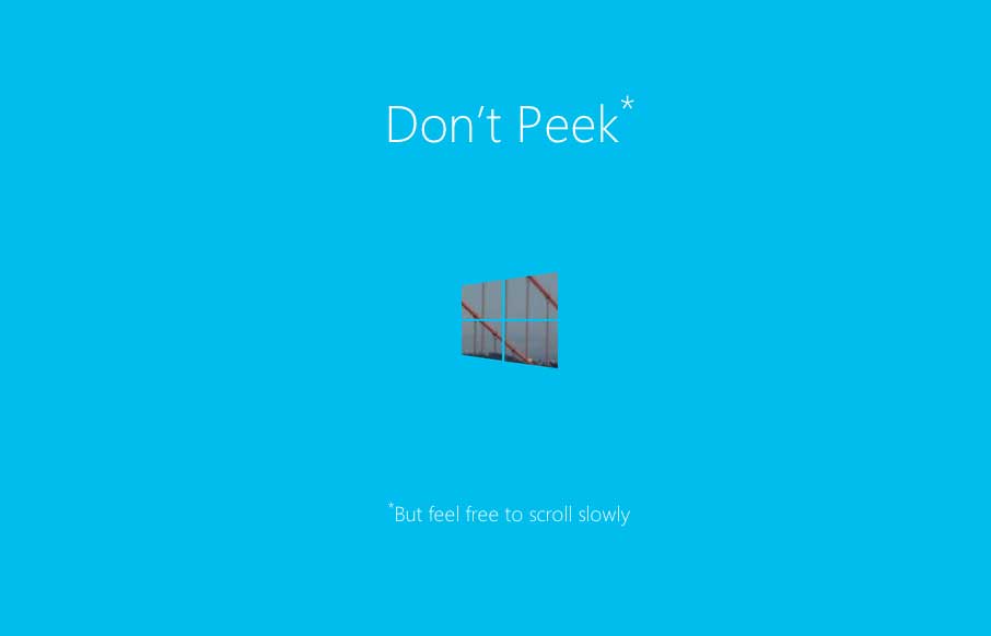
by Gene Crawford | Apr 1, 2013 | Gallery
I really dig this splash page for the Build Windows conference series. It’s simple and straight forward but there is also a little magic baked in with the mask like parallax design. We work on a lot of similar type work here at UMS for our conferences and this...