
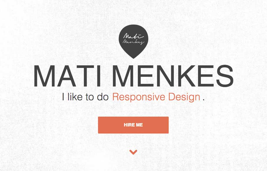
Clever use of the “fold out nav” on the left side of the page. It has the interaction of being opened and closed but it doesn’t feel hidden for hidden’s sake, if that makes any sense… I like the responsive design details and the E.T. illustration on the contact form will stick with me for days.


Fitts’s Law: Why the Easy Button Wins
Large, close targets are faster to hit than small, distant ones, that’s Fitts’s Law. A look at the 1954 rule behind buttons, prime and magic pixels, thumb zones, and dark patterns.


0 Comments