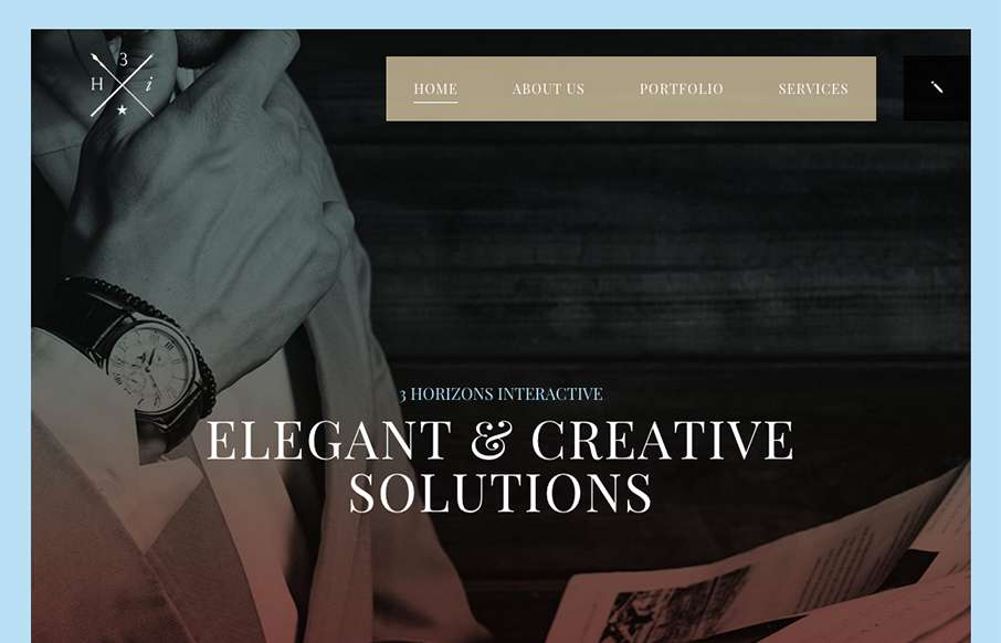
by Gene Crawford | Sep 28, 2015 | Design Firm, Gallery
This site design hits all the “now” standard things design and interaction wise. But sometimes you get it just right, I love the smooth feeling vibe to this site and the imagery is quite nice. The way the case study images load as you scroll for the first...
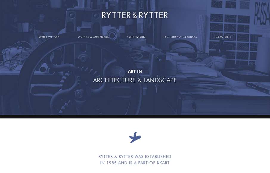
by Gene Crawford | Sep 23, 2015 | Gallery
Pretty clever single page layout for Rytter & Rytter. I like the way the sections are laid out as you scroll down, the flow feels nice. My favorite section is the pictures of their work, the way they’re cataloged and displayed is just clever.

by Gene Crawford | Sep 21, 2015 | Gallery
Nice use of images and supporting graphical elements. The flowers and website element colors match up with the photography really well, that’s not easy to get done. I like the way it scrolls rhythm wise as well as slight parallax scroll on the header...
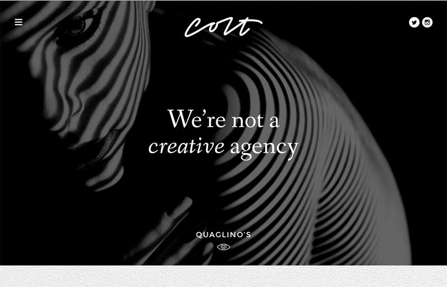
by Gene Crawford | Sep 14, 2015 | Gallery
Some pretty crazy interactions going on here. I dig it though. The colors and type that are paired together give it a rather open yet heavy feeling. I’m a fan of the navigation design too, see, what’s the harm in just showing the nav at all times?

by Gene Crawford | Sep 2, 2015 | Gallery
Simple approach to this website, but I love it. I love the big header image, it’s fun and feels fresh. Then the rest of the content is really straight forward but probably all you need for a site like this.