
by Aaron Griswold | Feb 17, 2016 | Gallery
Nice minimal site from Herdl out of the UK. Minimal because they hit you with headlines on the front page, instead of a lot of words (that your potential client never reads anyway… no… really). There’s meat in the Services pages – but the home...
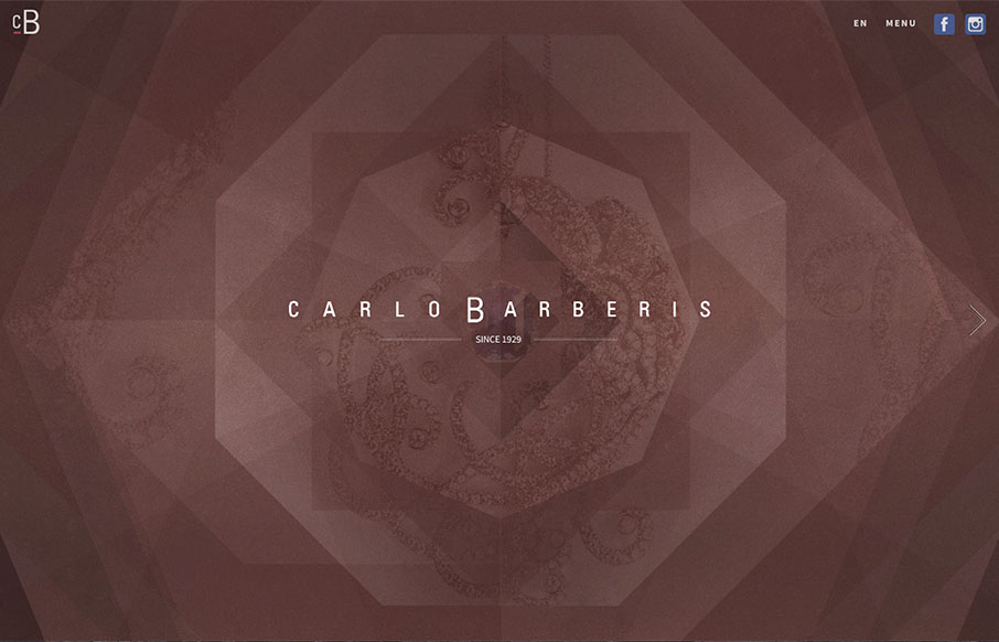
by Aaron Griswold | Feb 15, 2016 | Fashion, Gallery
This is a great showcase site for Carlo Barberis’ jewelry collection, out of Italy. Love how the home page is just a scroll slider, but before you start, the changing of the overlaying patterns already give movement and life to the page. Also think the...

by Gene Crawford | Feb 10, 2016 | Gallery
Pretty neat approach with the 8th Sphere website. No real images of anything, just line graphics and a dark background with white text. You don’t see that often anymore. I dig this approach. I like the main graphic a great deal, the process/machine one. Pretty...
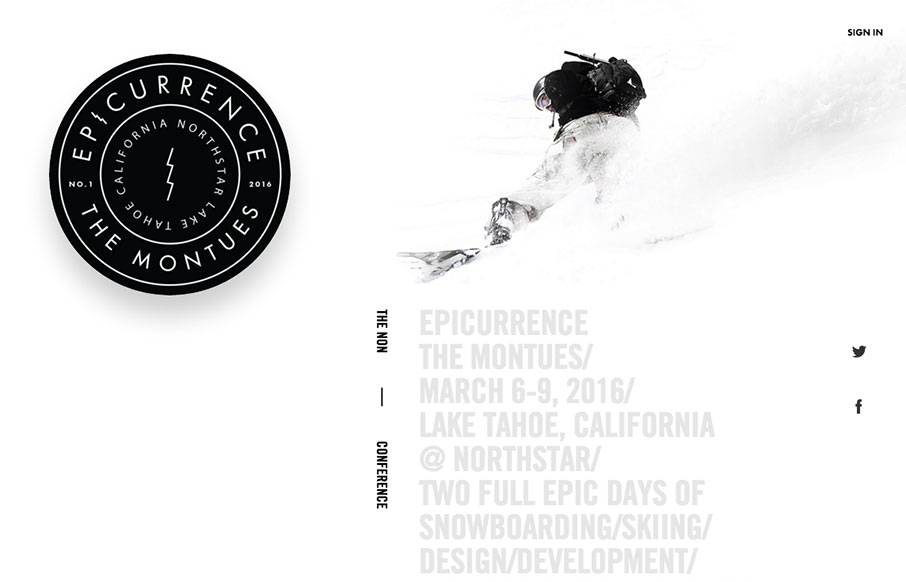
by Gene Crawford | Feb 8, 2016 | Conference, Gallery
Beautiful website for what I understand is a beautiful event. I love the ‘speaker’ pictures that slide in as you scroll down the page. The mobile view simply turns this off. A great mix of cool interaction and an almost minimal approach. Beautiful.

by Gene Crawford | Feb 8, 2016 | Gallery
New Uber. New Uber Logo. New Uber Website. Woot. I do like it a great deal.The large video/hero area is pretty slick, even if the contents are all perfect scenarios for the riders/drivers. My favorite part is the sections as you scroll down, those are some pretty nice...