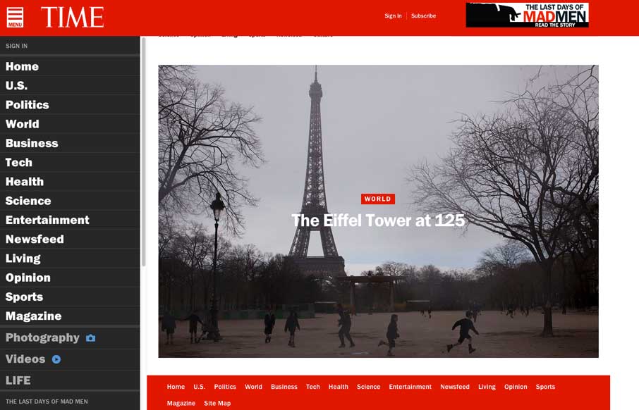
by Gene Crawford | Apr 4, 2014 | Gallery
Really great transition to a responsive website from Time Magazine. It’s really beautifully done. There are also sections like this World Trade Center article that show they are really trying to push the boundaries of online writing. Well done.

by Giovanni DiFeterici | Mar 20, 2014 | Gallery
Parkeriain.com is a portfolio site with a simple, but well conceived structure. I like how the footer has been strategically used to create a call to action on every page. It’s a small detail, but effective when flipping through the portfolio detail pages. Solid...
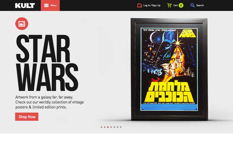
by Gene Crawford | Mar 17, 2014 | Gallery
Good simple layout, just kind of a blocky and bold presentation of stuff. What’s interesting to me is how when you interact with the menu it grays out the content, keeping you focused on the menu navigation itself. What do you guys think of that?
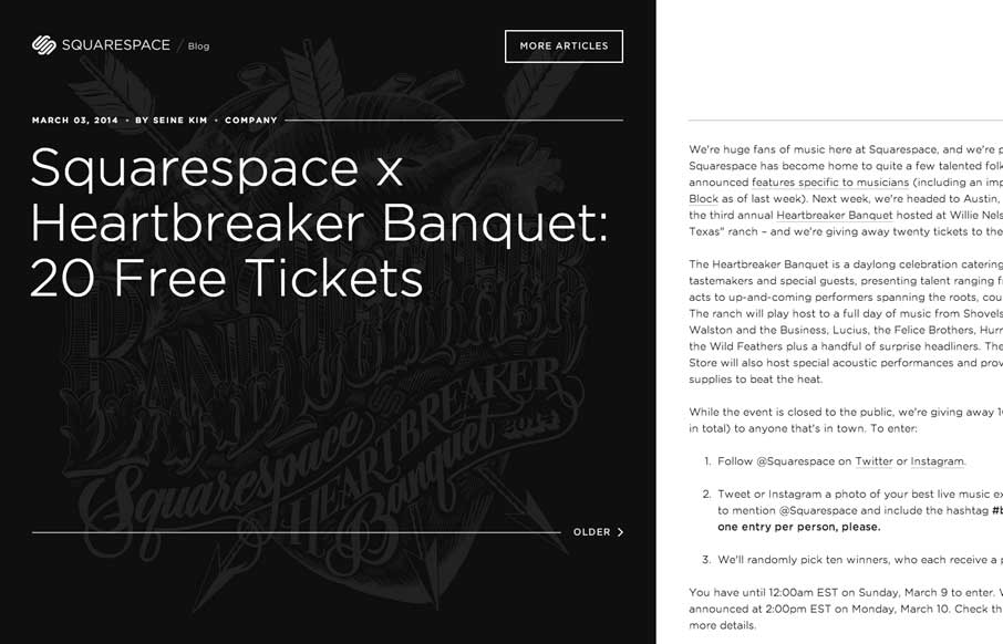
by Gene Crawford | Mar 11, 2014 | Blog, Gallery
The Squarespace Blog is very simple at first glance. Keeping all the relevant content for the post (or most recent post) front and center. You can slide open a list of past posts, that have nice little hover effects of the images. On the right is the now standard...
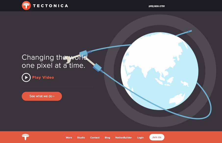
by Gene Crawford | Mar 10, 2014 | Gallery
Engaging illustrative website. There’s also plenty of interaction stuff happening on the home page to keep you interested. The thing I like most is that it’s not intrusive at all. You can engage with it by continuing to scroll or not. The look and feel of...