by Gene Crawford | Apr 16, 2014 | Gallery
I love the different screen width designs for Vox. There’s plenty of transitional differences for different devices. Go there and slide your screen around and check it out.

by Aaron Griswold | Apr 14, 2014 | Gallery
Nice minimal approach to the HARBR Co site design. I like the “menu” link and how that interaction works. It helps to keep the site clean and focused.

by Gene Crawford | Apr 10, 2014 | Gallery, Travel
Very interesting experience traversing this website. I love the scroll and fly feeling. Very slick execution.
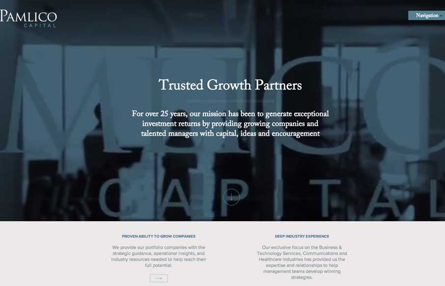
by Aaron Griswold | Apr 10, 2014 | Gallery
I like the use of the video in the header on the Pamlico Capital site. All of the slider interactions across the home page are nicely done too, they’re subtle enough and effective at the same time. I don’t think i’ve seen a site’s navigation...
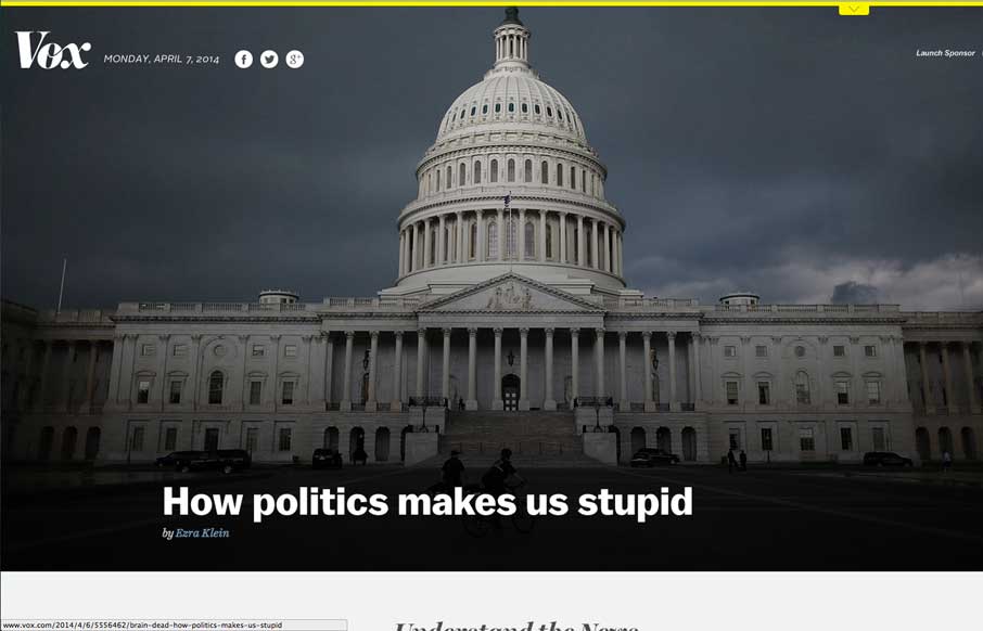
by Gene Crawford | Apr 8, 2014 | Gallery
Really dig the masonry like layout utilized here. It’s well done. I also like the light touch to the design so that the site itself doesn’t overpower the work displayed. That’s a hard line to walk.