
by Aaron Griswold | Nov 18, 2015 | Gallery
Slider / carousels are dead right? Not if they are done well, with a dash of novelty – like in this agency site by Digiti out of Belgium and New York. (as an aside, I’ve noticed a lot of good development work on websites out of Belgium this year) I admit,...

by Gene Crawford | Nov 16, 2015 | Gallery
Beautiful website. I luuuurve the big type based sections and the strong/bold colors. The way you scroll mostly acts like a slideshow, which works in this instance. Then the big reveal of the logo at the bottom is killer.
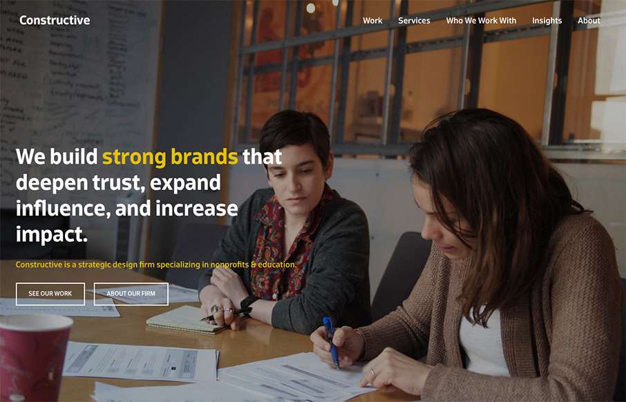
by Gene Crawford | Nov 4, 2015 | Gallery
It’s a fairly standard approach to a layout but I dig it. I like the way the large splash image blends on top of the modular boxes below it. It feels fluid this way. Add in some decent responsive design and it makes for a great site.
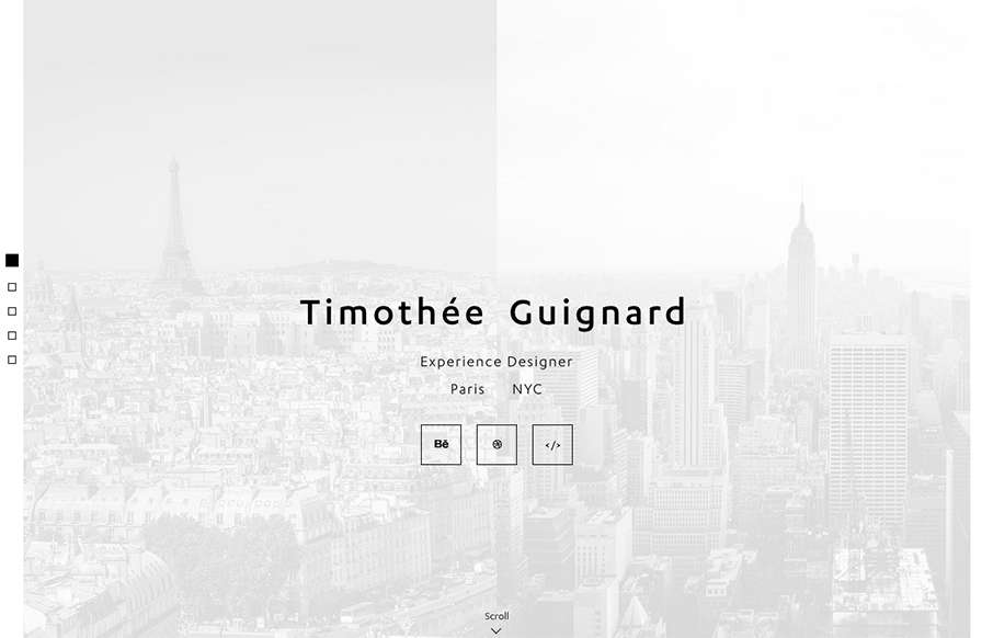
by Aaron Griswold | Oct 16, 2015 | Gallery, Portfolio
Love this portfolio site from Timothee Guignard out of NYC. Simple and understated on top – awesome detail in the Portfolio Detail pages. From the Designer: Portfolio of Timothee Guignard, UX, UI, Webdesigner Submitted by: Timothee Guignard Twitter: @timguignard...
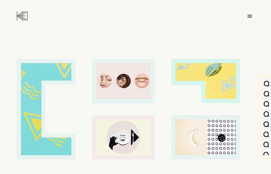
by Aaron Griswold | Oct 7, 2015 | Gallery, Portfolio
“One of these kids is doing her own thing…” and for Kata Farkas out of New York, that’s a good thing. This portfolio site is very experimental, from the side scrolling, to the About page being very “fluid” – even if it’s...