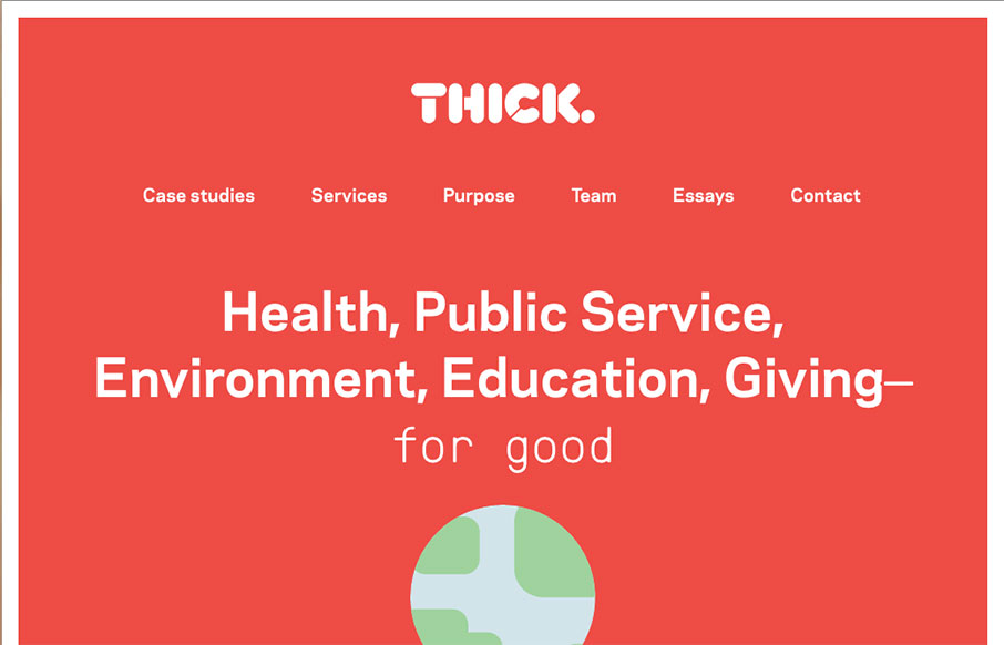
by Gene Crawford | May 18, 2016 | Design Firm, Gallery
Nice structured design. I dig the density of content to design as you make your way down the pagescroll. Solid colors and solid visual brand too. Check the globe on the main hero area as you scroll. Subtle but cool.
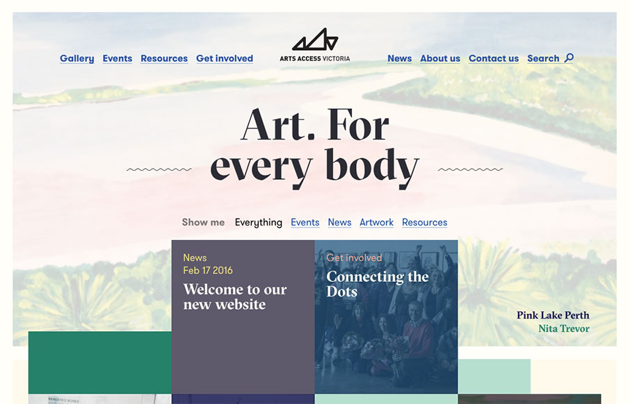
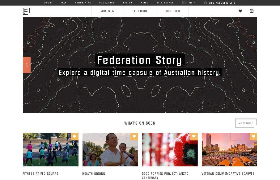
by Gene Crawford | Apr 5, 2016 | Education, Gallery
Generally intriguing and thought provoking layout to me. I love the asymmetry inherit in this layout. Balancing out a design with an offset approach like this is difficult but when done well is just beautiful. I think I actually love the simple blue + underlined links...
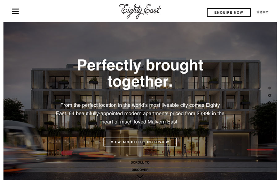
by Aaron Griswold | Dec 17, 2015 | Gallery, Real Estate
Good looking real estate site for Eighty East out of Melbourne, Australia – done by Yoke. I actually like the Chinese version a little better – the characters fit in with the aesthetic of the site even better in that version. Twitter: @welcometoyoke Role:...
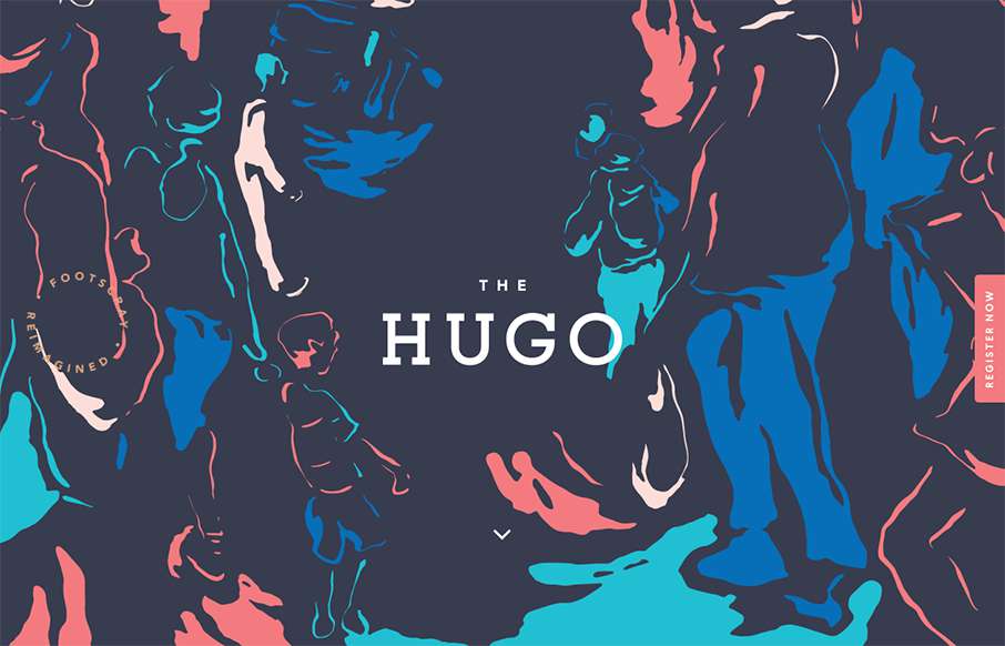
by Gene Crawford | Sep 28, 2015 | Gallery, Real Estate
Pretty clever use of the background image. I really like how it’s used as the hero area image, then you scroll down and the rest of the site kind of slides up. I like the register button and how it works too. Pretty cool 80’s inspired colors too.
by Gene Crawford | Apr 25, 2015 | Gallery, Nonprofit
I like the blocky-ness to this layout. Though at first it comes off as little cluttery looking, I find myself liking the way the navigation is done. The small black line with standard nav items and then the larger more central nav items under that to stand out more is...