
by Gene Crawford | Oct 25, 2012 | Gallery
Submitted by: Katherine Cory @katherinecory Role: Designer Cool take on a photography site. I like the parallax approach with the imagery too, it activates them in a very positive way. The background is pretty mute which makes the photos really stand out on top of it....

by Gene Crawford | Oct 24, 2012 | Design Firm, Gallery
The thing about this site that excites me is the experience it builds as you scroll down. It just keeps making you want to see more and you’re kind of sad when you get the “FIN” part. I love the interactions designed in here and there, like on the...

by Gene Crawford | Oct 3, 2012 | Design Firm, Gallery, Screencast Review
There’s so much design goodness here it’s making me giddy. From the rich colors, the way the home page slider has been designed to the custom photography it’s just a super high level effort. Check out the more in depth video review above or at this...
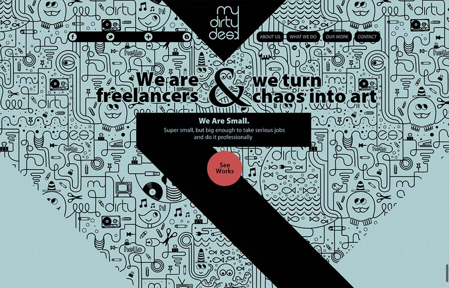
by Gene Crawford | Sep 21, 2012 | Gallery
This site design is all about the scroll. By engineering the design and illustration layout to work so well with the scrolling of the page it’s just turned into a great experience visually. I scrolled around on this thing for a good 5 or 10 minutes too, lovely...
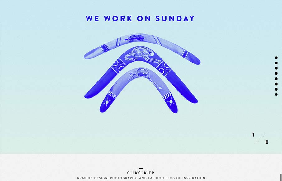
by Gene Crawford | Sep 19, 2012 | Gallery
Fun website! I like the duotone color look as well as the way the scrolling is designed. Also cool way to display the work, in the monitors like that, it’s not new to see but in this instance it feels fresh somehow – maybe it’s the boomerangs?