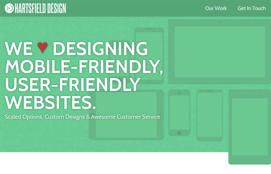
by Gene Crawford | Feb 8, 2016 | Gallery
I really like the texture used in this design, it breaks of what would otherwise feel like pretty big blank spaces of flat design. I also like the illustrations a good deal.
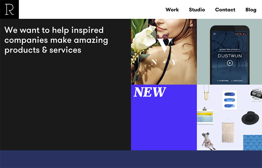
by Gene Crawford | Jan 28, 2016 | Gallery
Pretty slick looking layout for Studio Rodrigo. I really like the big open areas matched up with smaller product images in a small grid like it has. Pretty solid design as you scroll down the home page too. Love this site.
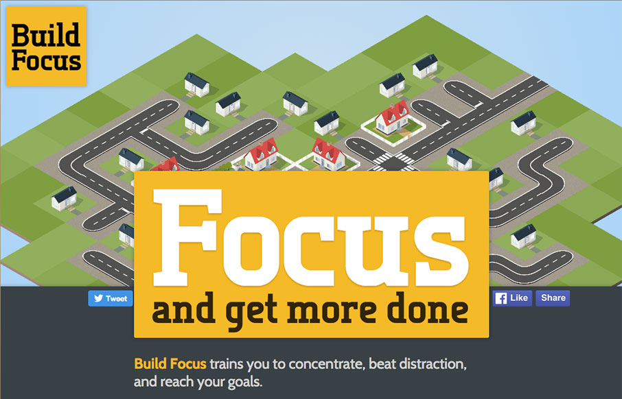
by Gene Crawford | Jan 28, 2016 | Gallery
I really like the simple approach of just centering the design here. The illustration is spot on and makes me want to see what this app will look like. Solid construction. From the Designer: This is the pre-launch landing page for a new productivity startup: Build...
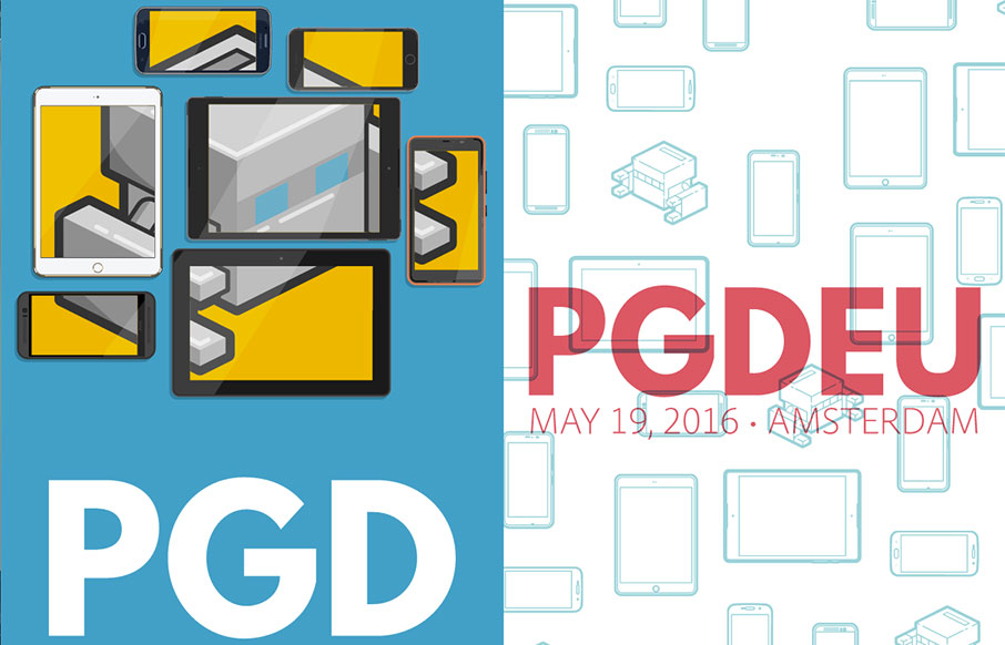
by Gene Crawford | Jan 25, 2016 | Conference, Gallery
Really solid yet simple conference website layout. I really like the big header area with the mobile device illustrations that scroll through/over the PG logo. Then I notice that the entire page scrolls over the logo. Neato! There’s clearly some love and care...
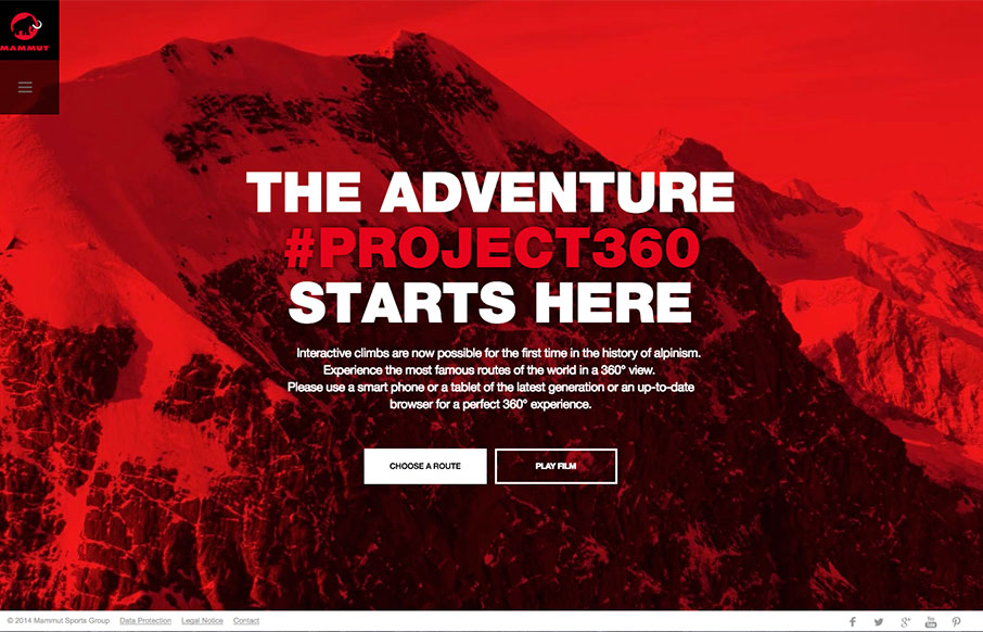
by Aaron Griswold | Jan 21, 2016 | Gallery, Travel
Whoa – just when you think you did well with your video background, then you see the Project360 site from Mammut. Then… the 360 image work all the way up the different mountain routes and the interactive work – incredibly nice.