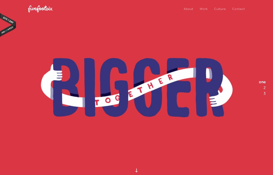
by Gene Crawford | Jul 6, 2015 | Gallery
Interesting twist on mixing a large hero/video area and a slider like interaction. The home page scrolls well into the about section, I think it works pretty well actually. Simply because they don’t hide the nav under a hamburger nav and just lay it out. I do...
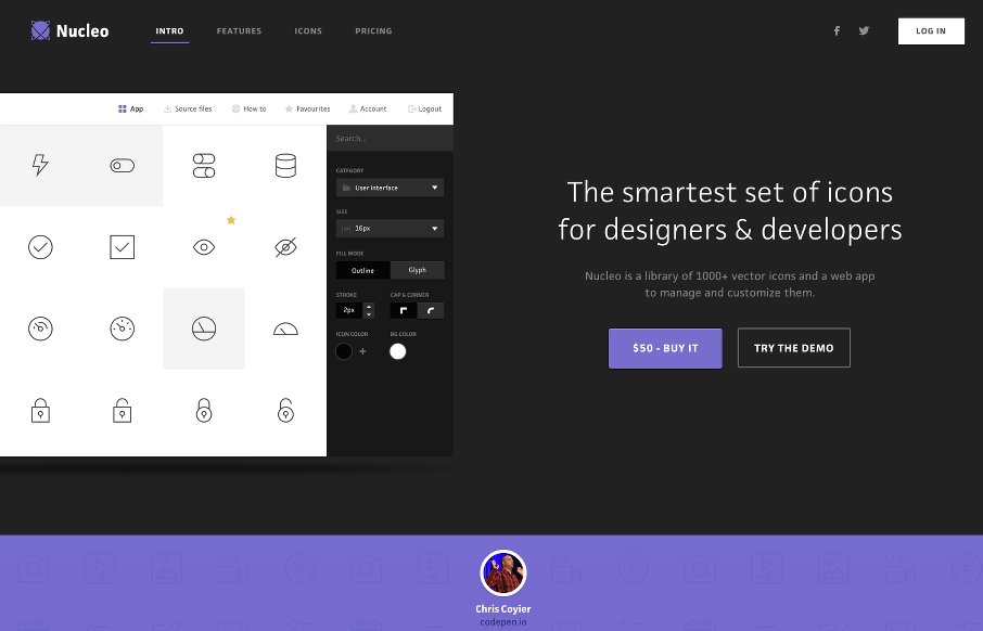
by Aaron Griswold | Apr 9, 2015 | Gallery
We hadn’t reviewed an app product site for a while, and at first I wasn’t sure to just keep this one as a resource for Radar, but I liked the basic clean look of Nucleo’s site. With suped-up intros and pre-loaders becoming a new trend, I like the...
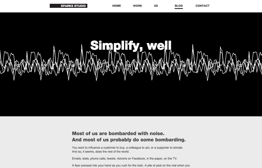
by Aaron Griswold | Apr 8, 2015 | Blog, Gallery
“If you want to be heard through the din, try being clearer, not louder.” We don’t normally showcase too many blogs anymore – and never do that for a blog post – except this one. From Sparks Studio in London, Michael Gough has a cool blog...
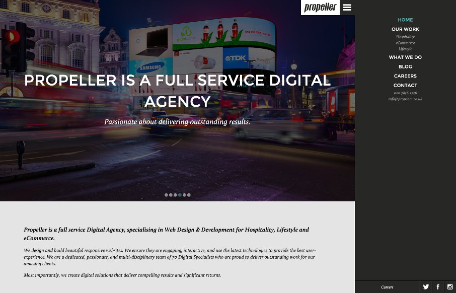
by Aaron Griswold | Apr 8, 2015 | Gallery
Like how Propeller Communications out of London uses the off-screen nav hamburger – but with a caveat – they start the site with with the hamburger open in vertical nav, that you can decide to close to gain screen real estate. From the Designer: Propeller...

by Aaron Griswold | Mar 23, 2015 | Gallery, Portfolio
Csaba Gabor’s portfolio is definitely different – from the vertical nav, to the myriad of areas he touches on here. The block design, with static images and animated gifs, some that link – make a cool secondary navigation – and the movement of...