
by Aaron Griswold | Jan 18, 2016 | Gallery, Shopping
Not our normal type of website to review – but good example of a good WooCommerce built site, for a bigger name in fashion / celebrityship. The home page is well done, well organized. Would like to see more in the shopping area – it is clean, but would...

by Aaron Griswold | Jan 18, 2016 | Gallery
I like digital marketing companies that can have a fun time with their own site – David Taylor Design out of New Jersey looks like that. The core of the site is solid (like the section under the Our Services – left/right copy/images – as is the...
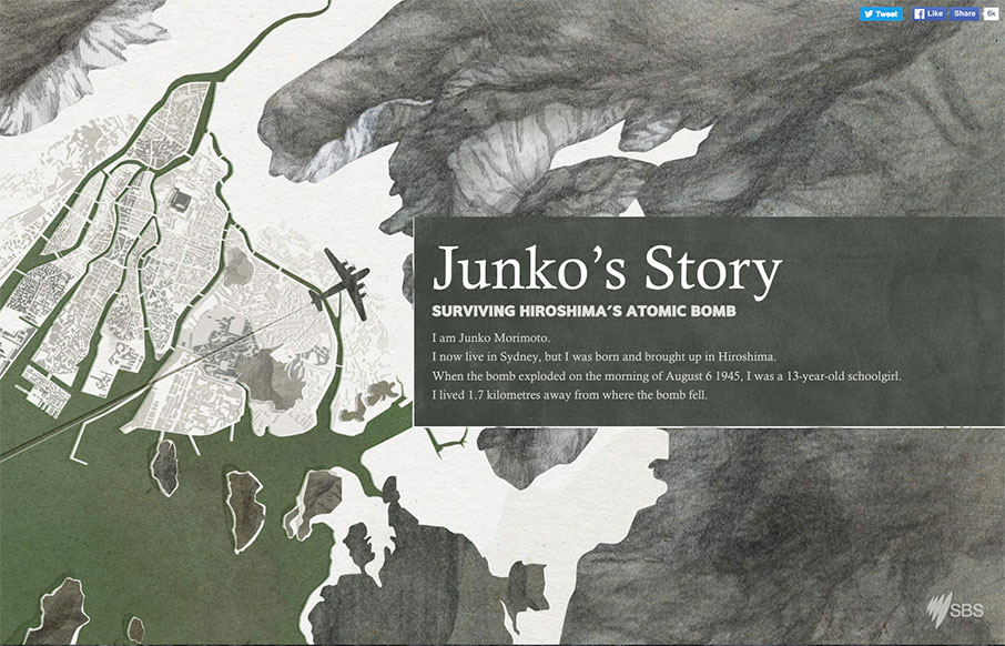
by Aaron Griswold | Jan 14, 2016 | Gallery
Love this one-pager by SBS out of Australia about Junko Morimoto, a Hiroshima atomic bomb survivor. Great mix of illustrations and real, with slight interactions to learn more on the side stories. And just an interesting design altogether.
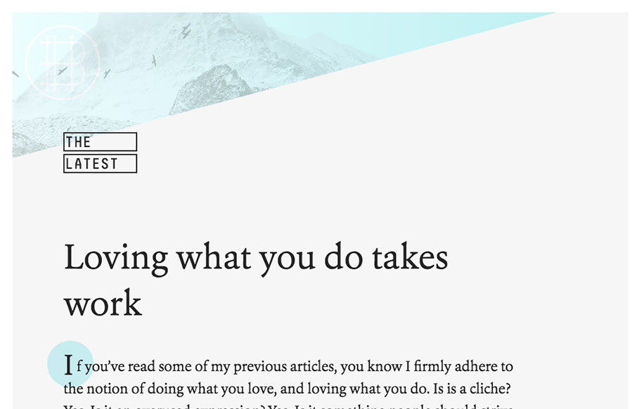
by Gene Crawford | Jan 13, 2016 | Blog, Gallery
Really brilliant layout for Bryant Hughes blog. It’s subtle and easy to get into. I love the subtle animation/movie of the birds in the background. Plus it’s all it needs to be and no more. Superbly done sir.
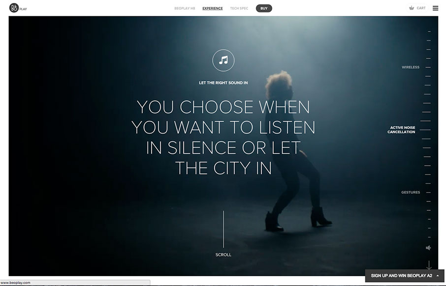
by Aaron Griswold | Jan 13, 2016 | Entertainment, Gallery
This is a great page (and site) from BEOPLAY – beautiful products on a beautiful site. The video and audio, and the way it interacts with scrolling is pretty special.