
by Gene Crawford | Jul 7, 2016 | Gallery
Unique in that it’s really just a single page layout for this business. You don’t see that too often. It’s beautifully simple too, which is always going to win in my book. Pantaloon Press publishes email newsletters distinguished by original writing,...
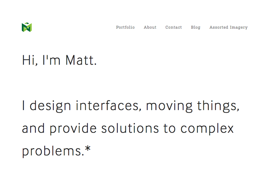
by Gene Crawford | Jul 6, 2016 | Gallery, Portfolio
I love this portfolio site for Matt Welch. “Most complex problems come with an NDA”, amen brother. I love that he just puts that up front for you to know. It’s the truth, if you do any sort of high-level work your public portfolio is going to be...
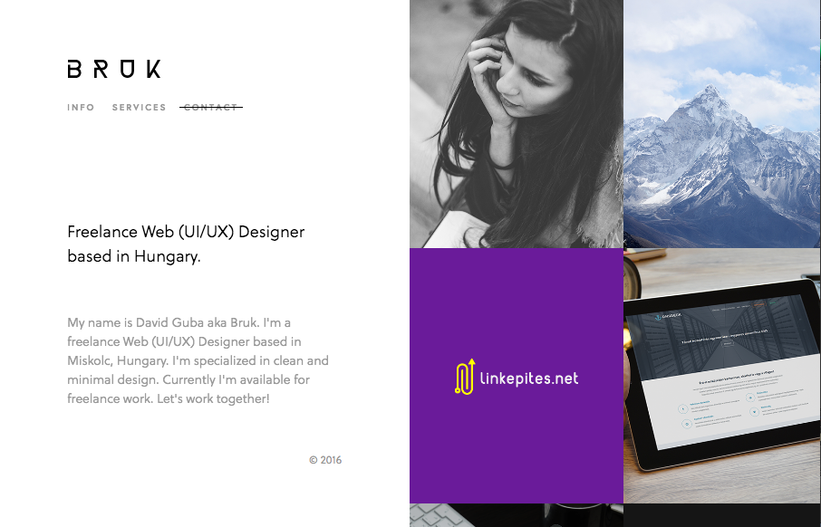
by Gene Crawford | Jul 5, 2016 | Gallery, Portfolio
Real simple design for Bruk but it also has some really nifty UI details. The left vs. right look is pretty cool and the “X” that stays visible when you check out some of the work is pretty clever too.
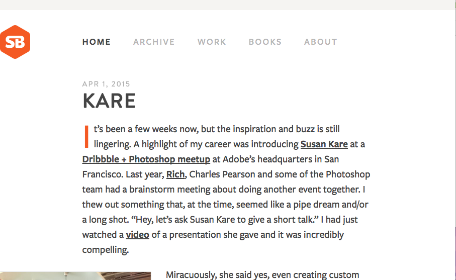
by Gene Crawford | Jul 5, 2016 | Blog, Gallery
I’m not entirely sure how old or new this version of SimpleBits is. But it’s simply beautiful. Simple, straight forward and editorial based design. The perfect blog look. Mmmm hmmmm.

by Gene Crawford | Jul 5, 2016 | Gallery
Really nice product based website. Honestly it’s really straight forward and in many ways set’s the “standard” for how one could approach a product site design. Plenty of straight up product details and minimal but well done interactions.