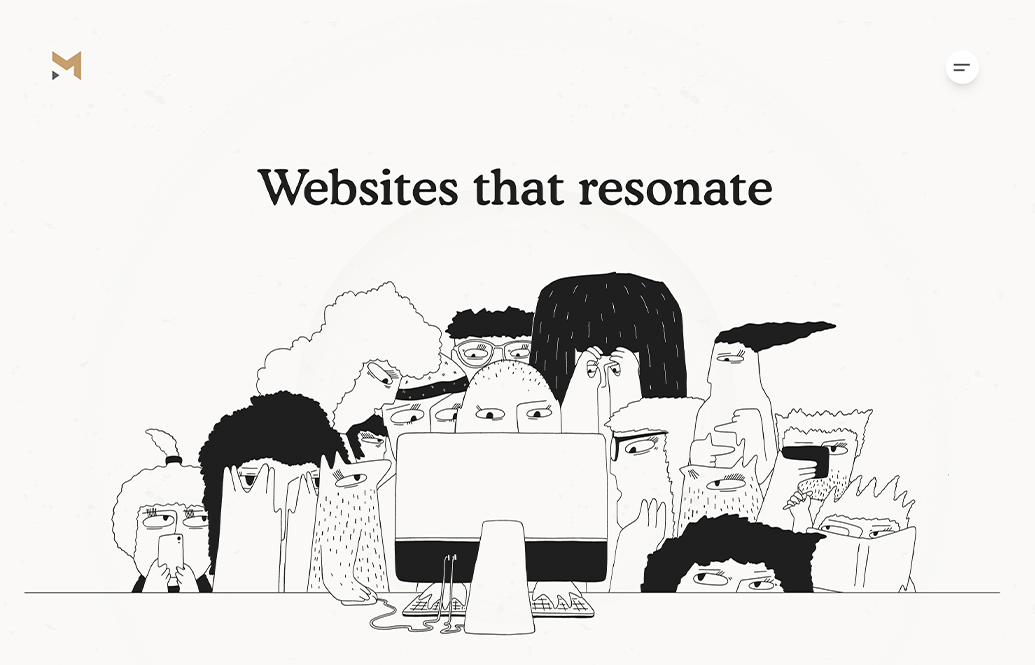
by Gene Crawford | Sep 20, 2023 | Design Firm, Gallery
I always love a simple & straight forward design. Especially when it’s an agency. Don’t get me wrong I like to be wowed too, but I also like to review something simple that works great. You’ve got to work hard at keeping things simple AND...
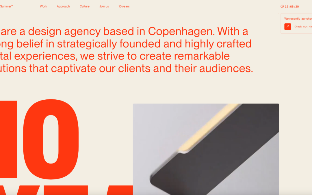
by Gene Crawford | Sep 20, 2023 | Design Firm, Gallery
Man, that page load “screen” is a solid piece of interaction. The video for it is chosen perfectly and it’s just a small detail that I love. I also love the grid and the way the type has such solid interplay with the layout. The colors feel classic...

by Gene Crawford | Sep 19, 2023 | Design Firm, Gallery
Very solid agency styled website design. I LOVE the use of large imagery and video like they’ve done here, much like Apple does with their stuff. The scroll interaction timing is well done and man, you just can’t go wrong with strong/clean typography!...
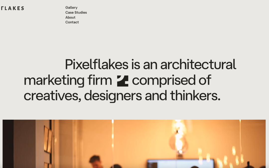
by Gene Crawford | Sep 18, 2023 | Design Firm, Gallery
Magnet Co’s website is modern and functional, with meaningful illustrations and a focus on SEO friendly content.
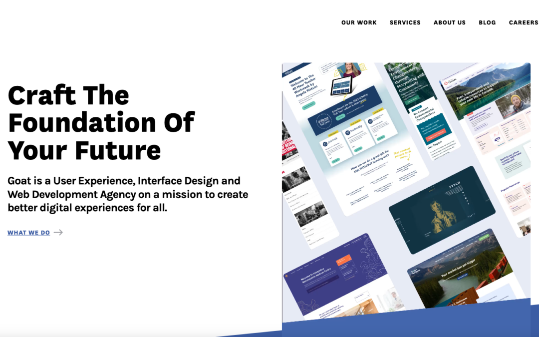
by Gene Crawford | Sep 14, 2023 | Design Firm, Gallery
I just LOVE the tight layout and grid that’s paired with such distinct differences in typographical choices. So solid. Different colors for each page/section just reinforces the thoroughness feeling behind the brand. Great work.