by Gene Crawford | Oct 20, 2023 | Design Firm, Gallery
Nice almost-single page layout. I like the detail work in the big graphics and the project grid layout a lot in this website design. It feels open and airy but not overly so, it comes across as being purposeful.
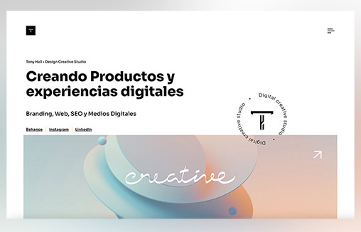
by Gene Crawford | Oct 12, 2023 | Design Firm, Gallery
Straight forward design but sometimes that is the most effective. It takes a certain level of design discipline to keep things simple as far as the interactions go. I like the minimalism here.
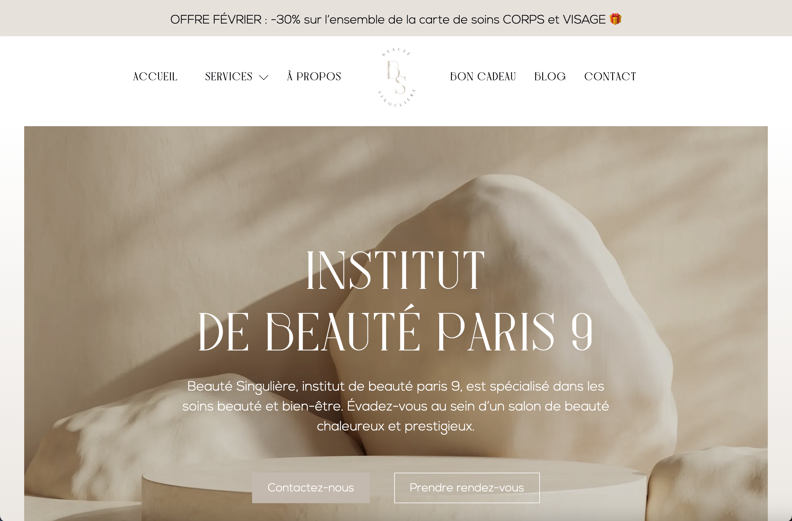
by Gene Crawford | Oct 5, 2023 | Gallery, Shopping
Clean and simple website for this brick and mortar business. I like the monochromatic palette and leaning into the photos is a good move. Solid layout and design here.

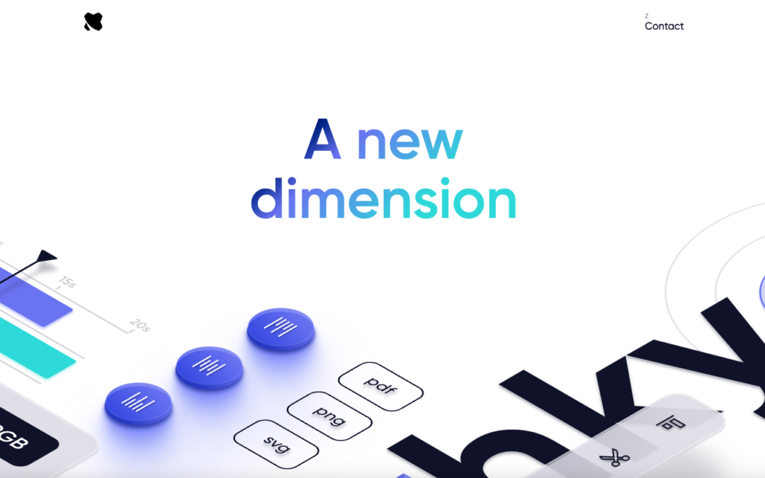
by Gene Crawford | Oct 3, 2023 | Design Firm, Gallery
I love the broken grid layout and the bold typography. I really like the small details in the fixed nav and logo too – nice little surprise. Also has a banger blog too https://blog.richardekwonye.com/bezier-curves
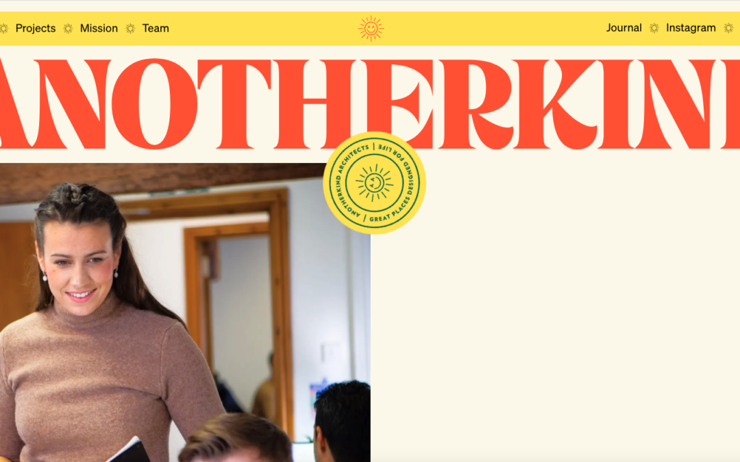
by Gene Crawford | Sep 27, 2023 | Blog, Design Firm
I love the color palette of their brand and the simplicity in the design approach. The screen transition from one page to the other is a nice detail. Solid, simply layout and bold typography. It feels old-school without being old-school. I dig it.