by Gene Crawford | Oct 19, 2012 | Gallery, Government
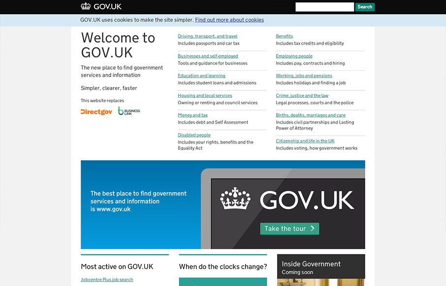
I absolutely love this design. I’ve tried to accomplish a design like this myself (a site that’s largely a big set of text links) and have fought opposition from management from the client and lost. Makes me very excited to see a solution like this for a...
by Gene Crawford | Oct 18, 2012 | Blog, Gallery
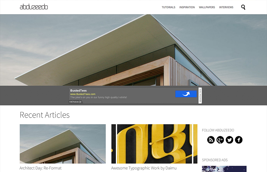
An evolving project. Note about the design from their blogpost. Abduzeedo will always be a work in progress. It’s in our DNA, we need to change and we want to change. We love to design things and with the blog we have freedom to try. We might fail, but the only...
by Gene Crawford | Oct 18, 2012 | Design Firm, Gallery
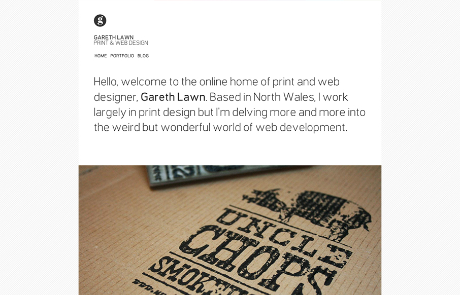
I like the minimal design for Gareth Lawn’s website. Putting the type front and center with a big central image. Nicely designed responsive solution too.

by Gene Crawford | Oct 16, 2012 | Design Firm, Gallery
Nice and clean and full of sharp corners but somehow it feels open and inviting to read. Super awesome photography in play makes this site really stand out, when you have photos like these you got to show them off, right? I also like the mouse over zoom effect on the...
by Gene Crawford | Oct 15, 2012 | Gallery
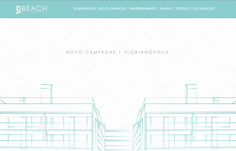
Very intense parallax design. Lots of movement and photos flying around, it’s almost too much. But in the end it’s a nice design and execution. D’Beach building parallax website – developed for those who want to live in a beautiful place near...
