by Gene Crawford | Mar 25, 2014 | Gallery, Government
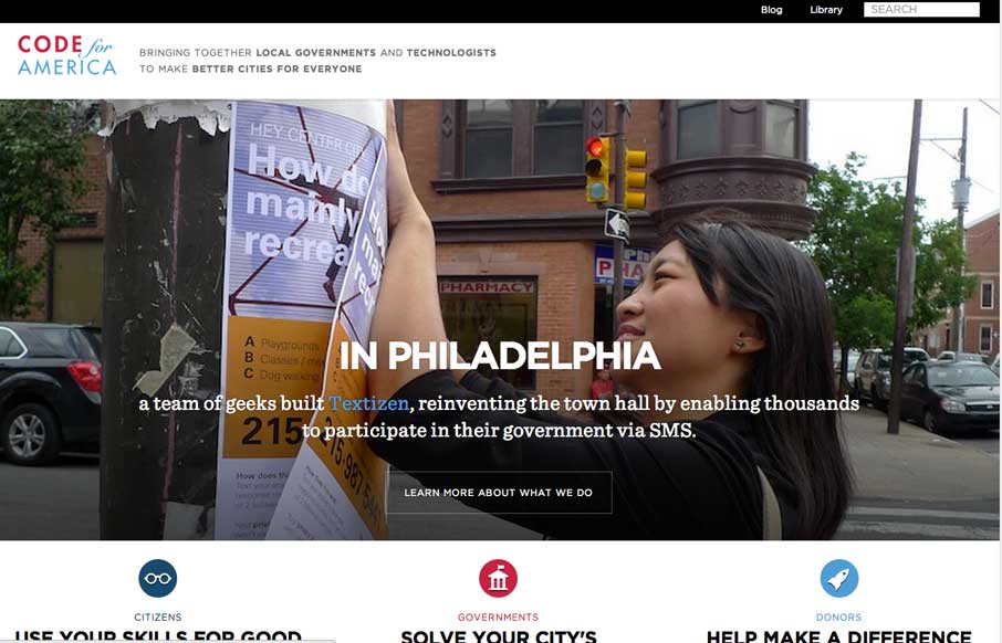
A very nicely executed and clean responsive site design. Pretty sure the team behind this website utilized a mobile first approach, I can feel it in my bones when I scaled it down and the mobile widths are easier to use than the desktop size.

by Gene Crawford | Mar 25, 2014 | Gallery
The new Sparkbox website has so much of the awesome going on I can’t cover it all in one sitting. It’s been a long time coming but they’ve really delivered a great responsive website design. Spend some time really digging through this one folks,...
by Gene Crawford | Mar 24, 2014 | Food and Beverage, Gallery
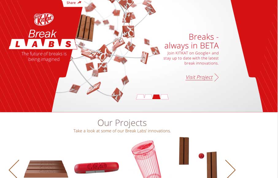
This site isn’t “new” to everyone but it’s definitely worthy of being in the gallery here. There’s a lot going on with this site, like the slight movement and different projects they’ve launched. Likely this one is the one most...

by Gene Crawford | Mar 24, 2014 | Design Firm, Gallery
Huge has always been about the experience. Their new website is nothing short of great expectations as far as i’m concerned. Good experience, and good mental model of the website – backed up by the overlay navigation. I also kind of dig the way the main...

by Gene Crawford | Mar 21, 2014 | Gallery
It isn’t that “new” of a re-launch now but the new Stuff & Nonsense website is as always wonderful. I love the responsive header illustrations. Both informing and entertaining – which is how Mr. Clarke always is.
